Christopher's NBA Stats App Journal

Hello!

This is actually my first stab at an app challenge and journal like this, so we’ll see how it goes.

Right now I’m focusing on the basic requirements, with the others attempted at once the basic ones are done.


Day 1 and 2

My first two days were spent reading API documentation, creating models, and creating the view model.

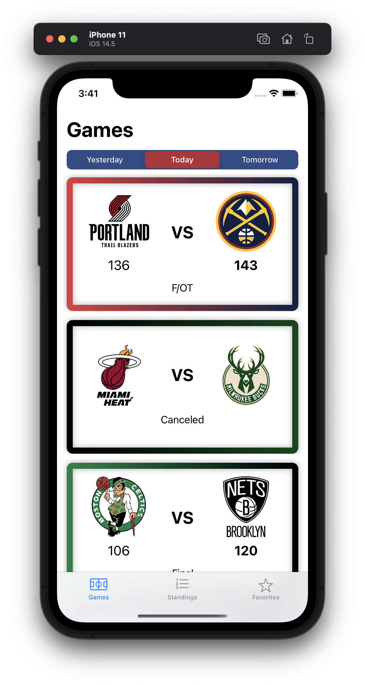
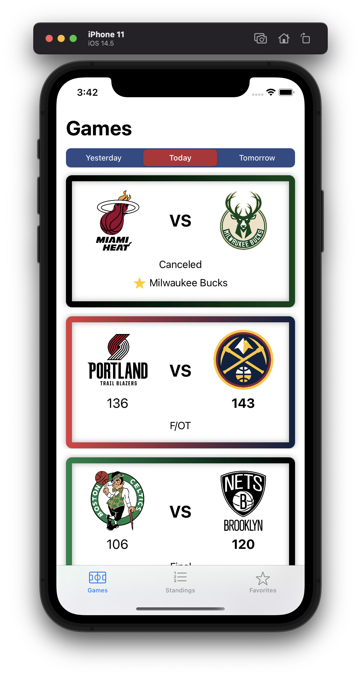
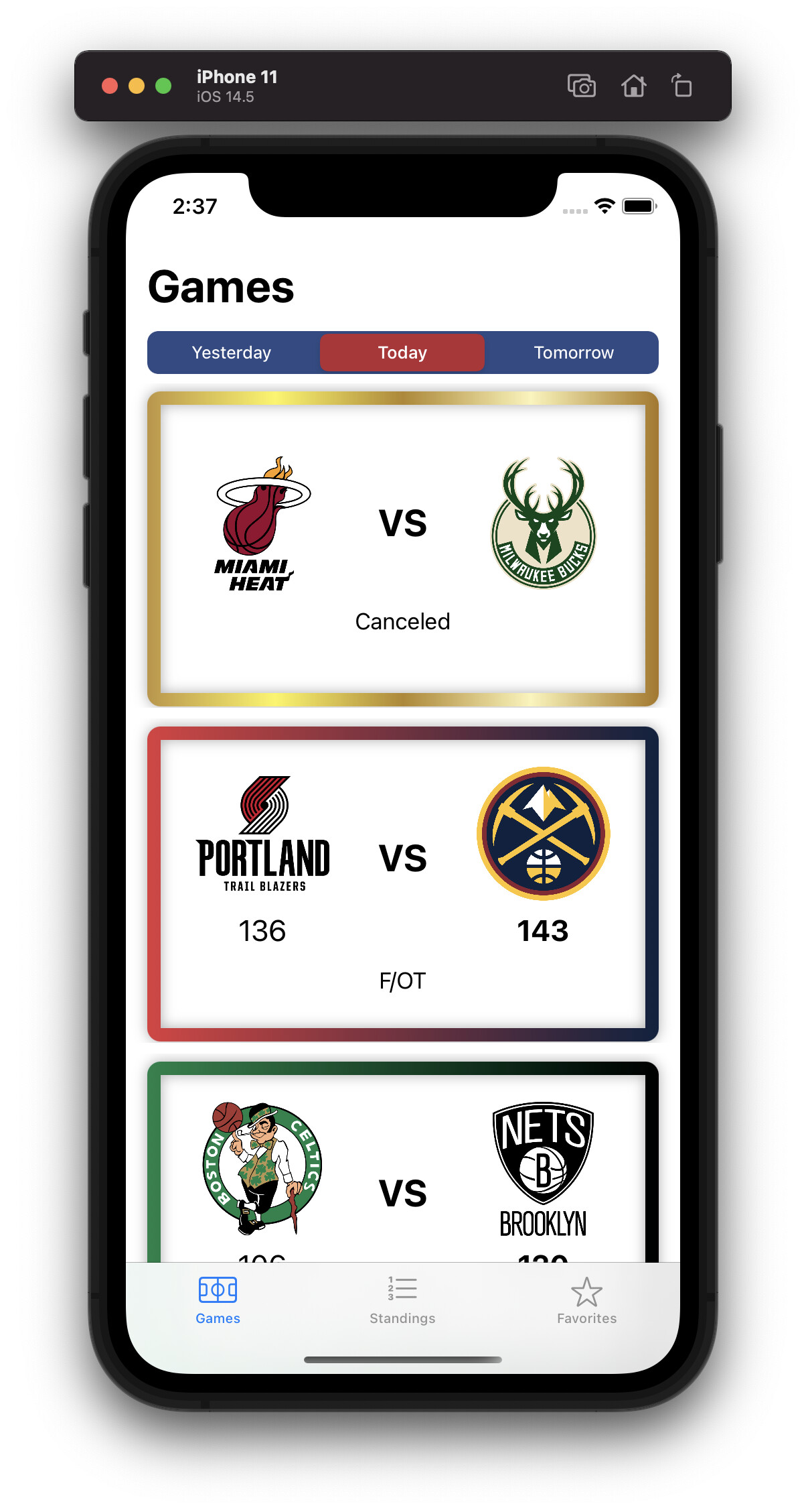
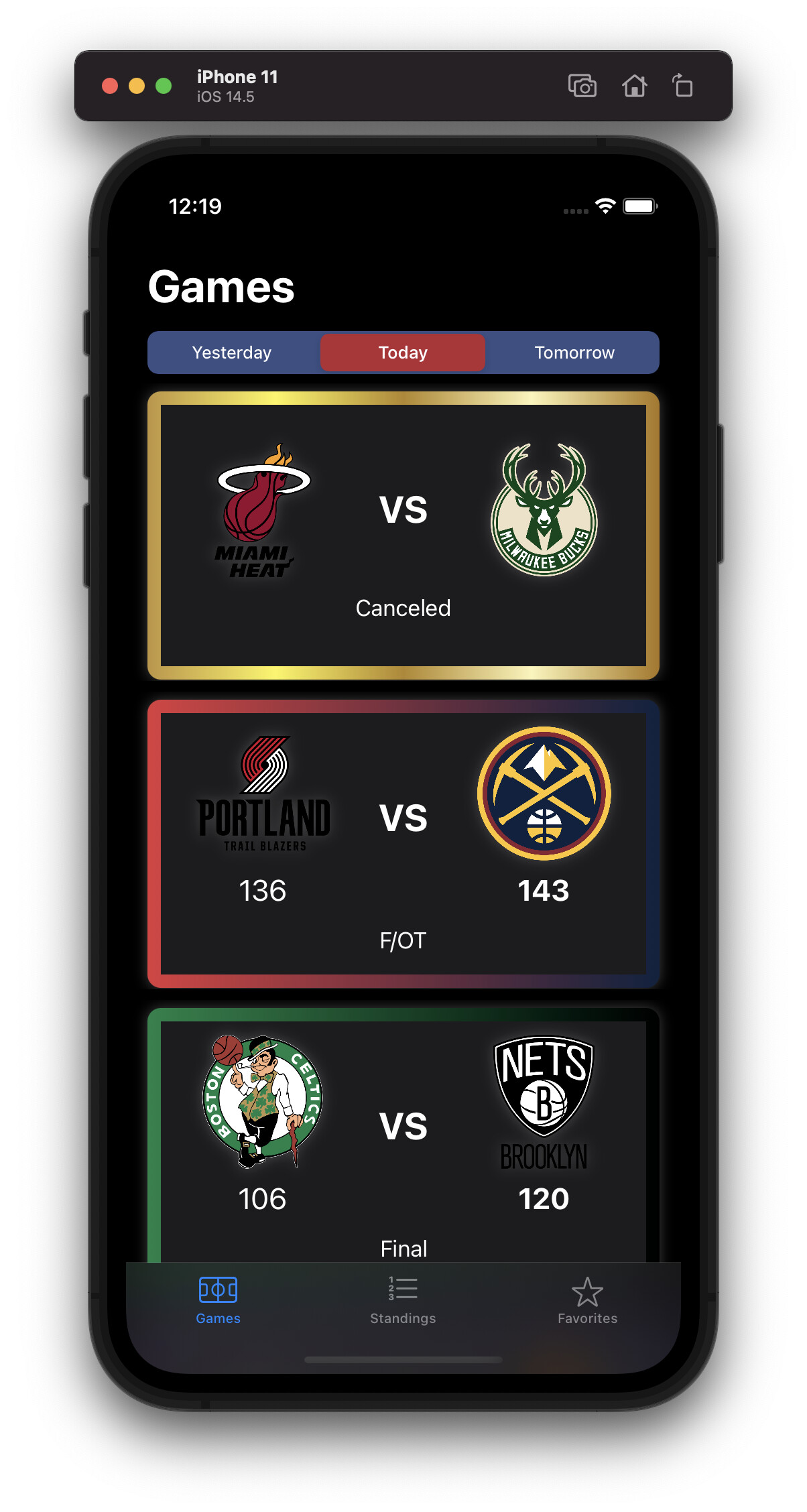
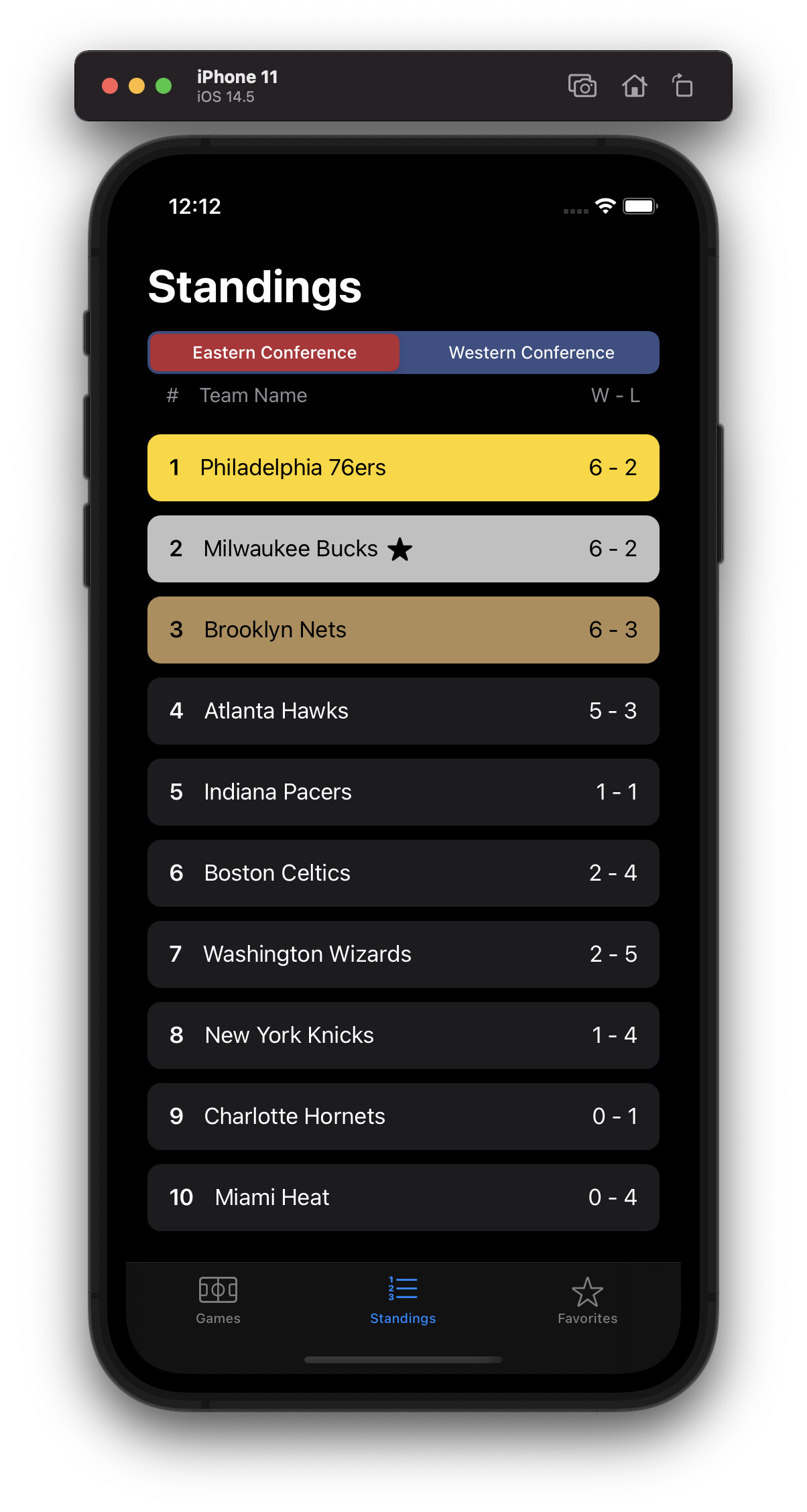
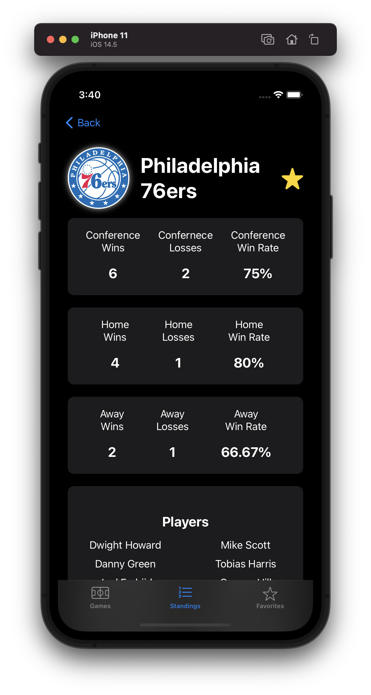
I’m pulling data mainly from the Teams (All) and Games by Date APIs. I will also be pulling from the Current Season and Are Any Games In Progress APIs as well for additional information.

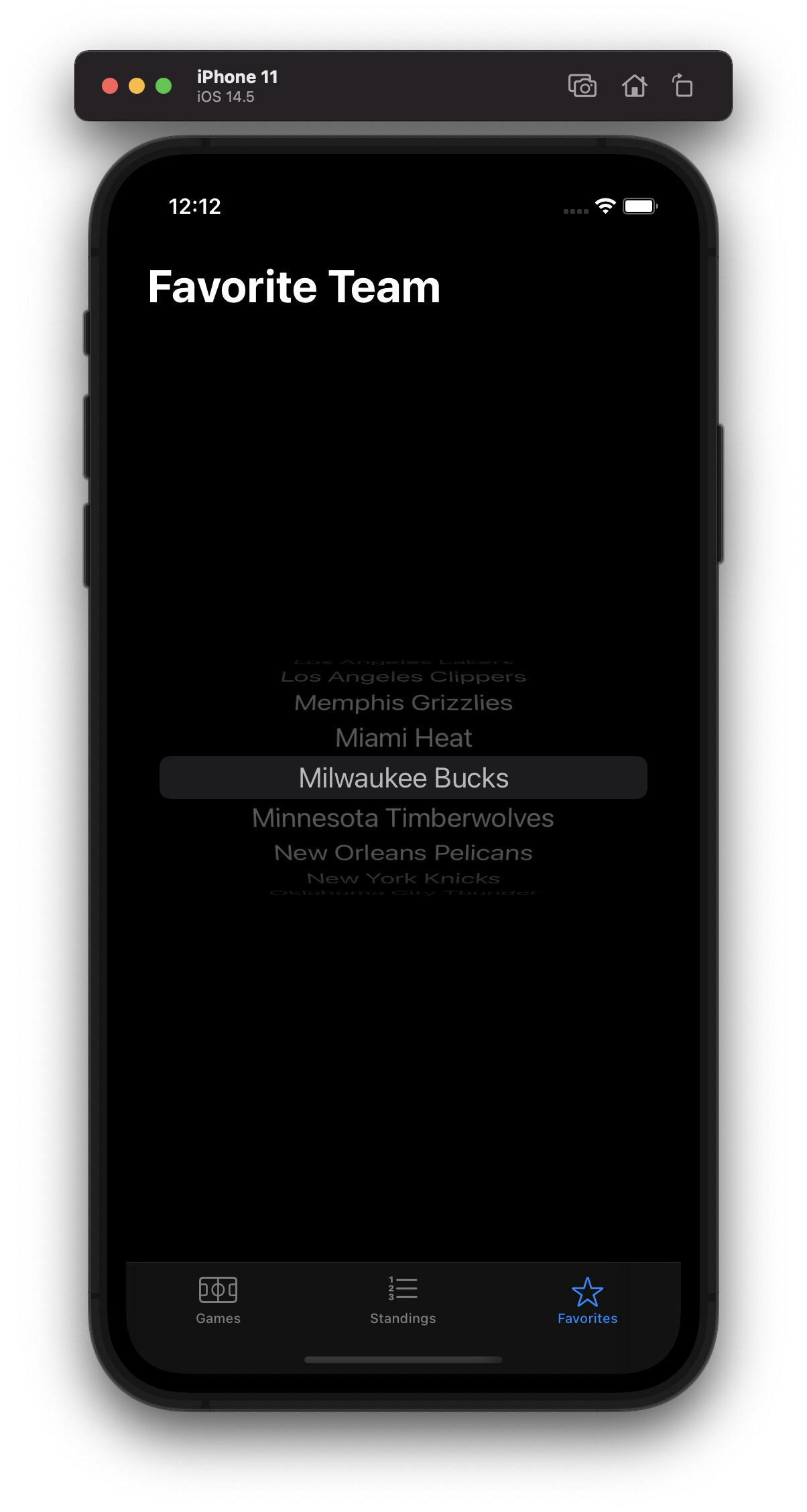
I created models for a Team, a Game, and a Season.

I created a Constants file for the api urls and key.

For some of the data sent back, the documentation says it’s of type Date or DateTime. Turns out you can just using strings for these.

I also got to play around with Date, Calendar, and DateFormatter objects to get dates and adjust the data forward or back. These also came in use since I have to pass in a date with the format of 2021-JUL-04. I had a helper function handle the month and the main function handle everything else related to fetching data from the Games by Date API.

Each API had it’s own function to call the data from since the return types differed. I have three game-storing array properties for each day and one for the team.

I also did some setup in my view model since it’s possible there aren’t any games on any given day, so I know that data was actually fetched. I created some boolean properties to handle this.

Tomorrow, I’ll start working on the UI, since most of the data handling is covered for now. I’m sure I’ll have to modify it along the way, but, this should do for now.

2 Likes

Day 3

I’ve made good progress on the UI. I’ve added tabs for the scores, standings, and favorite settings.

There’s a picker for each day and a card showing the team logo and team name. Depending on the game, a status (i.e. Canceled, Scheduled, etc.) will be shown or a score.

I worked mainly on displaying the games, which you can see below:

When a game is scheduled, the time it’ll be starting will be shown. This involved converting a string into a Date, formatting it how I want it, and converting it back into a string for further use. I also modified the Games by Date data-fetching method to use date-formatting to get the right month key.

As you may have noticed, the team logos aren’t lined up and evenly sized which leads into the major problem I’ve ran into.

The team logo urls are from .svg files. Getting data from the url, putting it into a UIImage, and putting that in an Image, like the City Sights App, doesn’t work.

From what I can tell, by looking into this issue, this method of displaying images doesn’t support .svg files. It seems Image supports .svg, but it has to be stored locally in the app. Which is why I used WebKit to get the images display. The issue with this besides the aforementioned issues, is it can sometimes takes a few seconds to load and the sizing can be different.

I also added scores, but since there aren’t any ongoing games now or yesterday I can’t really test it.

I do want to play around with incorporating the team colors somehow and messing with the text styling, but that’s a project for tomorrow. Also I plan to start working on the standings as well, since I’m not sure what to do about the images.

2 Likes

Day 4

Today I worked on the Standings Tab, the Favorites Tab, and the implementation a favorite team across the other two tab.

I started with the Standings tab.

  • I changed the tab icon slightly to the numbered list icon.

  • I created a Standing model based on the API documentation

  • I created two arrays within GameModel to contain the teams apart of the Western and Eastern Conferences respectively.

  • I created a new function to gather data from the Standings API

  • The Standings API takes in the season to give the standings for. The Current Season API provides the key needed for the Standings API. So the function for Standings takes in the key which it gets from the data-fetching function for the Season, after the data was retrieved.

  • Each conference array was sorted by the win percentage of each team

  • The StandingsView shows a picker for each conference that shows each array depending on the state of the picker

  • Colors were added to cards containing the top 3 teams with the highest standing for each conference.

Then I started work on the favorites’ tab.

  • The favorite tab contains a picker that let’s you choose a team

  • The teams are displayed in alphabetical order and sorted within GameModel

  • When a team is selected an index for the teams array is stored within GameModel

Finally, I worked on displaying the favorite team status in the Games and Standings Tab.

  • I used if-statements to compare against the team that corresponds with the stored index

  • No team will have a favorite status until a team is selected in the Favorites Tab.


That leaves work on the Games tab UI. As I said in the last journal, I want to play around with incorporating the team colors somehow. Additionally, I’m still trying to find a better solution to display the images than WebKit.

2 Likes

Day 5

Today I worked mainly on UI refinements:

  • I made the Games and Standings Pickers more colorful
  • The scores display works (was already implemented but untested)
  • I added the team’s city into the Games view
  • Game cards have a border that is a gradient of the team primary colors
  • Modified text styling in the Games card
  • Added a key to the Standings view


What was a process was incorporating the team colors. The Teams API provides the colors has hex codes, which need to be converted to RGB for use within the app. With the Colors I was able to make a Linear Gradient.

I’m not sure what exactly was wrong, but for a while I got a solid black stroke. Don’t know what I exactly did to fix it, but it works now.

The only thing that I’m really left with is to find a better way to load the team logos.

1 Like

Day 6

I finally found a solution to load the team logos.

Using CocoaPods, I downloaded SVGKit (GitHub - SVGKit/SVGKit: Display and interact with SVG Images on iOS / OS X, using native rendering (CoreAnimation)) which lets you work with SVG Images.

Getting the data from the image link from the API, I can use that data to make a SVGKImage. This can be easily turned into a UIImage using a SVGKImage method. From there it’s just using the UIImage in an Image.

I decided to scrap the team name/city in the Games view and make the images larger. I can cut down on the size of the card as well. The exact sizing might need to be modified when there are some scores.

I also implemented sorting by favorite team (if selected).
Note: Below screenshots show games that happened on June 1st

Original:

Favorited:

There isn’t much else to be done here. There might be some minor UI tweaks going forward, but there’s nothing major to be done.

2 Likes

Day 7

I decided to change something.

Currently, when a team is selected as the favorite team, the Game view shows a star with the team name.

Since there is already a gradient border along the game cards, why not have that display whether a team is favorited?

So that’s what I did. I created a golden gradient and was able to set up to change the gradient when it is displayed.

I created a published variable in the Game model to update when a change occurs.

Getting a default color, being a gradient between the two team’s primary colors, was much more difficult than I thought it would be. It took a lot of debugging to work properly.

Of course, it resets itself when the favorite team is changed.

1 Like

That looks great!

1 Like

Thanks!

1 Like

Day 8

I decided on implementing Dark Mode support. While the app technically supported it, there wasn’t any optimization for it. Mainly, there are instances where white text is one a white background making it unreadable.

There wasn’t anything to be done for the Favorites View, since SwiftUI took care of it, but I had to work on the other ones that SwiftUI didn’t automatically take care of.

I started with the Standings view and made the background color of the cards a dark gray, with the exception of the Top 3 for each conference.

4th and below all have white text with Dark Mode enabled, but I made the Top 3 have black text, regardless of whether Light or Dark Mode is set. White text was hard to read on the Top 3, especially against the gold and silver colors.

Moving onto the Games view, I also changed the card color to the same dark gray, but some of the team colors are dark colors or black, so it didn’t look right.

I put in a very faint white shadow. You can’t really see it with the brighter colors, with it only visible with the darker ones. I didn’t design it this way; it’s just how it came out.

A slightly lighter shadow is also used on the team logos so black/dark text is readable.

1 Like

Day 9 & 10

I came across the idea of adding a more detailed view of adding a detail view for each team which lists more detailed stats about each team and the name of it’s players.

Getting the additional details was already data I had from the Standings data so I just had to create the UI.

It’ll show Conference, Division, Home, and Away data. In some instances, where none of a team’s games falls under one of these categories, it won’t show, which is why in the screenshots below no Division Data is shown. Depending on the team, what is shown can vary, but the players are always regardless of these factors.

For the players, I had to make a Player model and write code to pull from the Players by Team API. This was a lot like pulling the current standings, since I needed to have the team abbreviation.

To display the name of the players, I used a LazyVGrid which took some trial and error on how to use.

Something that does bother me a little, is I’d like all the team names to be left-aligned, but then the grid isn’t centered on the screen, so, I’d rather see this than use padding, since name length can vary.

I initially wanted to do a sheet pop-up, but I couldn’t get to work how I wanted to, most likely because of how the teams are displayed as a list.

Of course, this new view is optimized for light and dark mode.

As much as I want to say nothing else will be added, it’s possible something will pop-up in my head between now and the deadline.

1 Like

I think I’m in a good spot to say this is finished.

I’m very happy with the end result of this, especially since this was my first crack at something like this.

Here’s a video of the app in action:

2 Likes

Great job and thanks for posting! Good color scheme overall, and I like too the way you listed the players. Instead, of having them all in a standard List, where you need to scroll down, it’s cool that you can glimpse them in one view

1 Like

Happy to hear you liked my design. That player list was a bit tricky to get how I wanted it.