I am attempting the War challenge for Lesson 5, but I am having difficulty putting the spacers in for the vertical alignment. Each time I place a vertical spacer in it pushes the cards to the top of the screen as well as making the deal button look rather weird as well. Also the CPU portion text for numbers and player doesn’t look like it is in the middle even though spacers are used.
Any advice?
Can you post your code and what your view looks like?
Here is the code that I have
//
// ContentView.swift
// Lesson5Wargame
//
// Created by Charles Beecroft on 4/23/21.
//
import SwiftUI
struct ContentView: View {
var body: some View {
VStack{
ZStack{
Image(“background”).ignoresSafeArea()
VStack{
Spacer()
Image(“logo”)
Spacer()
HStack{
Spacer()
Image(“card3”)
Spacer()
Image(“card4”)
Spacer()
}
VStack{
Spacer()
Image(“dealbutton”)
Spacer()
HStack{
Spacer()
Text(“Player”).foregroundColor(.white)
Spacer()
Text(“CPU”).foregroundColor(.white)
Spacer()
}
HStack{
Spacer()
Text(“0”).foregroundColor(.white)
Spacer()
Text(“0”).foregroundColor(.white)
Spacer()
}
}
}
}
}
}
}
struct ContentView_Previews: PreviewProvider {
static var previews: some View {
ContentView()
}
}
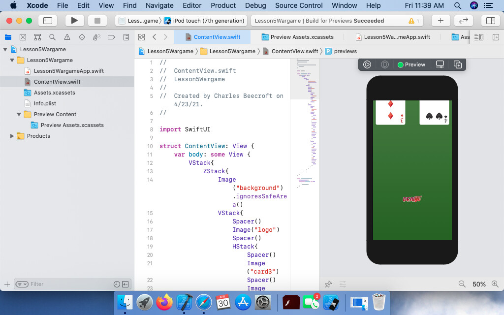
And here is the view I am seeing on the device itself.
@ebeecroft
Hi Charles,
The trick to getting the layout right is to look at the overall design.
You need a background over which you have a number of objects.
So the initial Container you require is a ZStack into which you place your background Image.
Also inside that ZStack you need a VStack as a Container for all of the objects you are going to arrange vertically… the Logo, the two cards side by side, the deal button and lastly the Player and the CPU scores side by side.
Hint: The player and his score are in a VStack as are the CPU and its score. Both of those are in a HStack
Once you have the basic layout, then you can go about adding the Spacer() object or using the spacing: parameter that is available for the VStack and HStack
Hope that gives you a bit of a pointer in how to approach the challenge.
So I just swapped out the Initial VStack for ZStack, but I am still having issues getting the other code to line up correctly. The cards and scores appear fine but when spacers are added to the logo and the deal button it causes the screen to get messed up.
So here is the new version of the code with the changes.
//
// ContentView.swift
// Lesson5Wargame
//
// Created by Charles Beecroft on 4/23/21.
//
import SwiftUI
struct ContentView: View {
var body: some View {
ZStack{
VStack{
Image(“background”).ignoresSafeArea()
}
        VStack{
            Spacer()
            VStack{
                Image("logo")
            }
            Spacer()
            HStack{
                Spacer()
                Image("card2")
                Spacer()
                Image("card3")
                Spacer()
            }
            Spacer()
            VStack{
                Image("dealbutton")
            }
            Spacer()
            HStack{
                Spacer()
                VStack{
                    Text("Player")
                    Text("0")

                }
                Spacer()
                VStack{
                    Text("CPU")
                    Text("0")
                }
                Spacer()
            }
        }
    }
}
}
struct ContentView_Previews: PreviewProvider {
static var previews: some View {
ContentView()
}
}
Any advice?
Why put the background in a VStack by itself? That’s not really needed
How does your view “get messed up?” In what way??
You can also add parameters to the spacers rather than just Spacer()
Change this statement to:
Image(“background”)
    .resizable()
    .ignoresSafeArea()
What .resizable() does is allow the image to occupy the space available rather than consume the space that relates to it’s true size. In other words the image is actually larger than the vertical and horizontal ‘points’ dimensions of the device.
As a consequence it pushes out beyond the device bounds and any other views inside that ZStack also fall outside those bounds if they are near the edge.
1 Like
The screen doesn’t show all of the information on the device.
As for the background I kept it seperate because the spacers are making the device screen wonky as shown in the picture. So I decided it would be best just to keep it separate for the time being.
I didn’t know you could add parameters to the spacer as that was never really covered in the lessons.
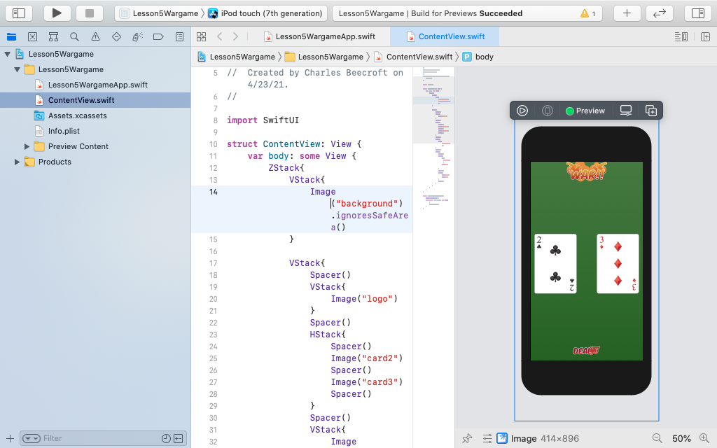
I added the resizable parameter and moved the background image to within the VStack and its kind of made it look a lot worse.
Here is the new code
//
// ContentView.swift
// Lesson5Wargame
//
// Created by Charles Beecroft on 4/23/21.
//
import SwiftUI
struct ContentView: View {
var body: some View {
ZStack{
VStack{
VStack{
Image(“background”).resizable().ignoresSafeArea()
}
Spacer()
VStack{
Image(“logo”)
}
Spacer()
HStack{
Spacer()
Image(“card2”)
Spacer()
Image(“card3”)
Spacer()
}
Spacer()
VStack{
Image(“dealbutton”)
}
Spacer()
HStack{
Spacer()
VStack{
Text(“Player”)
Text(“0”)
                }
                Spacer()
                VStack{
                    Text("CPU")
                    Text("0")
                }
                Spacer()
            }
        }
    }
}
}
struct ContentView_Previews: PreviewProvider {
static var previews: some View {
ContentView()
}
}
So now the screen looks like this:
Hi Charles,
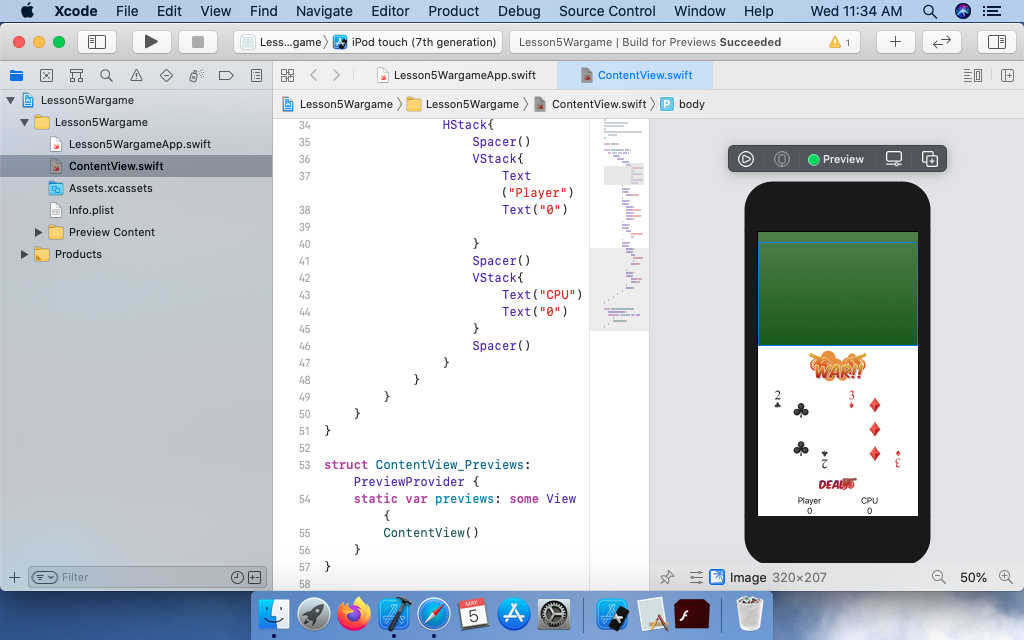
I can see that you are struggling so here is what your code should look like so that the layout looks correct.
struct ContentView: View {
    var body: some View {
        ZStack {
            Image("background")
                .resizable()
                .ignoresSafeArea()

            VStack {
                Spacer()

                Image("logo")

                Spacer()
                HStack {
                    Spacer()
                    Image("card2")
                    Spacer()
                    Image("card3")
                    Spacer()
                }
                Spacer()

                Image("dealbutton")

                Spacer()
                HStack {
                    Spacer()
                    VStack {
                        Text("Player")
                        Text("0")

                    }
                    Spacer()
                    VStack {
                        Text("CPU")
                        Text("0")
                    }
                    Spacer()
                }
            }
        }
    }
}
That actually did work, thank you for helping me out with this. I am kind of curious why it worked. So why did Lesson 5 challenge require a different setup than what was previously built in the Lesson 4 challenge? In the Lesson 4 Challenge it was a VStack with ZStacks inside of it, and in this one it was a ZStack with a VStack inside of it.
So why does one challenge require a different setup from the other and why did some of the other code formats not work and this one did?
In the challenge 4 layout you have two images that must be positioned one above the other so they both go in a VStack.
On top of each image you have to place a rectangle and on top of that two text elements one above the other.
So each image goes into it’s own ZStack and below the image you have a VStack containing the two Text elements and then you add a background to the VStack which is wider that the Text object because you specify padding before you specify the background.
For the WarCard game case you need to look at what elements make up the view. So the order is:
- a logo at the top,
- two cards side by side, which are in a HStack
- a deal button
- two player scores side by side, which are in a HStack
So all of those go in a VStack
Then you have a background image that is behind all of that so you have to wrap the main VStack inside a ZStack and place the Image as the first element in the hierarchy in the ZStack followed by the VStack containing the objects making up the game.
I’m assuming that you understand that a ZStack allows items to be placed on top of each other. The first item listed in the ZStack is the one at the back. The items following down the page sit on top.
Over time you will get used to how to use the combinations of the different Stacks to get the UI look you need. Stick with it.
Hope that helps.
Thanks Chris_Parker, I had the same issue, the first Spacer that I inserted just pushed the images out of the screen and then the “resizable” modifier added to the background image was the solution.
1 Like