Making textfield bigger, without changing font size

Hello Community!
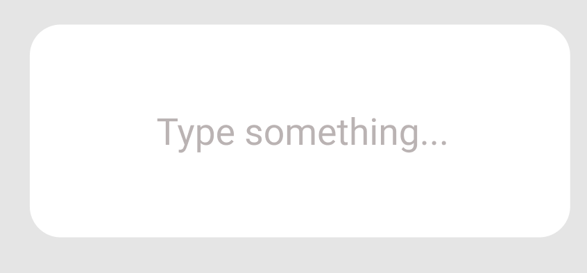
I have a textfield like the one on the image below. I want the Textfield to be activated when the user taps on the white rounded rectangle or the text. Right now the tap has to be placed exactly on the text for it to do something. Setting a height for the textfield doesn’t seem to be helping.

One possible solution I have come up with, is using a text editor with a line limit of one instead and setting the frame to the one of the rectangle, but then the text is not centered.
Another solution could be using the new FocusState, but I see bug potential there.
Is there a better way of solving this?

What code are you using to achieve what you have in your picture? Please show your code so we can help you figure out a solution. There are ways to adjust the tap target but exactly how to do it depend on what your existing code looks like.

Thank you- here is my code:

import SwiftUI

struct ContentView: View {
    
    @State var text = ""
    var body: some View {
        
        ZStack{
            RoundedRectangle(cornerRadius: 15)
                .foregroundColor(.gray)
            TextField("Type something..", text: $text)
                .foregroundColor(.white)
                .padding(.horizontal)
        }
        .frame( height: 200)
        .padding()
    }
}

struct ContentView_Previews: PreviewProvider {
    static var previews: some View {
        ContentView()
    }
}

Try this @Timo

The Preview crashes so dunno what the deal is there but it certainly works on the simulator.

struct ContentView: View {
    enum FocusedField {
        case textField1
    }
    @FocusState private var focusedField: FocusedField?

    @State var text = ""

    var body: some View {

        ZStack {
            Color.secondary.opacity(0.5)
                .ignoresSafeArea()
            ZStack{
                RoundedRectangle(cornerRadius: 15)
                    .foregroundColor(.white)
                TextField("Type something..", text: $text)
                    .foregroundColor(.white)
                    .padding(.horizontal)
                    .focused($focusedField, equals: .textField1)
            }
            .frame( height: 200)
            .padding()
            .onTapGesture {
                focusedField = .textField1
            }
        }
    }
}

niceee thank you- that works. :smiley: I noticed that it works with only one ZStack, but either way this part:

  Color.secondary.opacity(0.5)
                .ignoresSafeArea()

is necessary for it to function properly. Is there any easy explanation why? Because I really wonder…

I added an “outer” ZStack with a background color so that the white rectangle in the “inner” ZStack that surrounds the TextField (which is confined by the .frame() modifier to 200 points high) stood out. I mean you could make the rectangle color whatever you like but you need to test it in light mode and dark mode to make sure that it looks OK.

Probably better to do something like this so that in either dark or light mode it works quite well. Not so sure that you need a rectangle to be 200 points high though.

ZStack{
    RoundedRectangle(cornerRadius: 15)
        .foregroundColor(.secondary)
        .opacity(0.4)
    TextField("Type something..", text: $text)
        .padding(.horizontal)
        .focused($focusedField, equals: .textField1)
}
.frame( height: 80)
.padding()
.onTapGesture {
    focusedField = .textField1
}
1 Like

Here’s another approach that doesn’t use ZStacks…

struct BigBackgroundTextField: View {
    @State var text: String
    @FocusState private var isFocused: Bool
    
    var body: some View {
        TextField("Enter text...", text: $text)
            .focused($isFocused)
            .frame(height: 200)
            .padding(.horizontal)
            .background(.regularMaterial, in: RoundedRectangle(cornerRadius: 15))
            .onTapGesture {
                isFocused.toggle()
            }
    }
}
1 Like