Hi, Codecrew! It’s been a while.
I started this challenge project a few days ago. Here are some screenshots of my work.
-
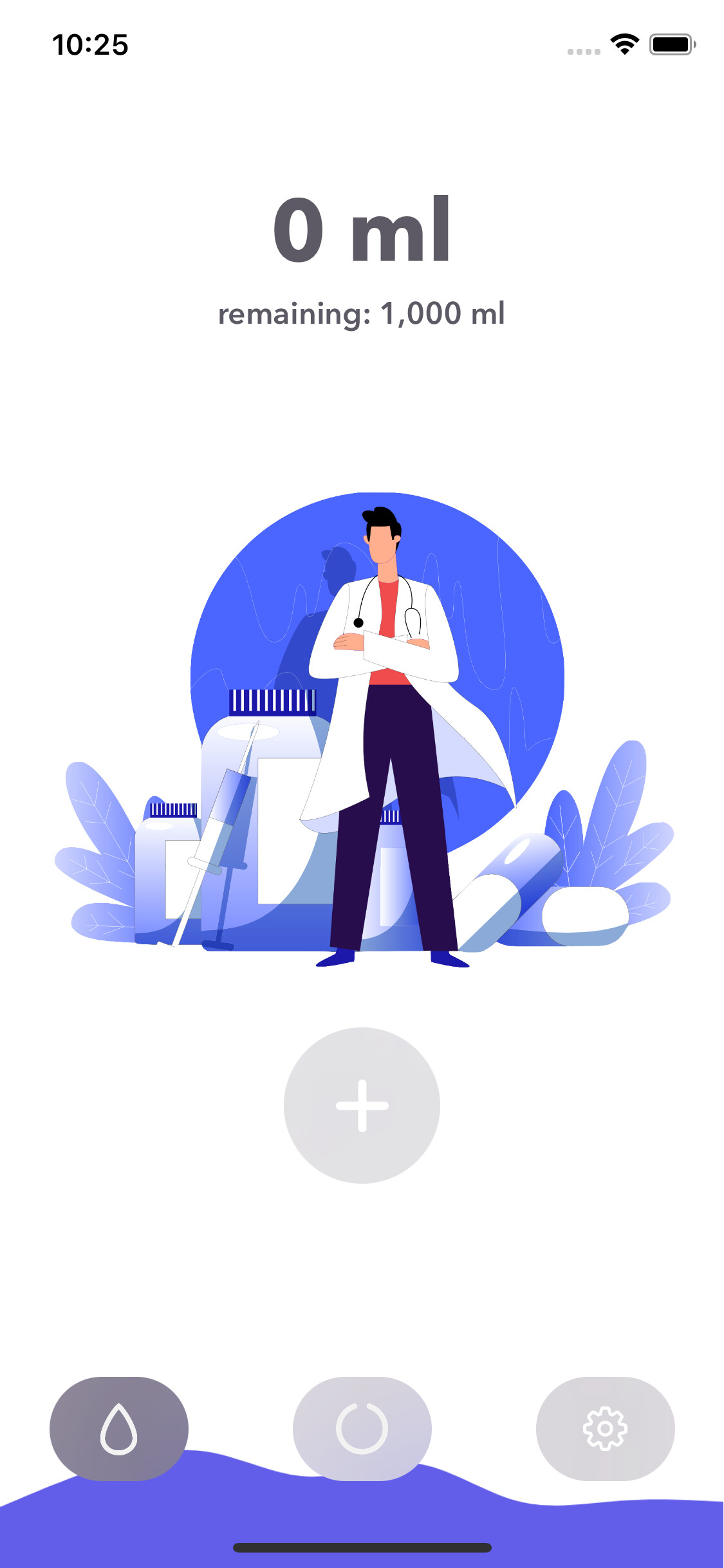
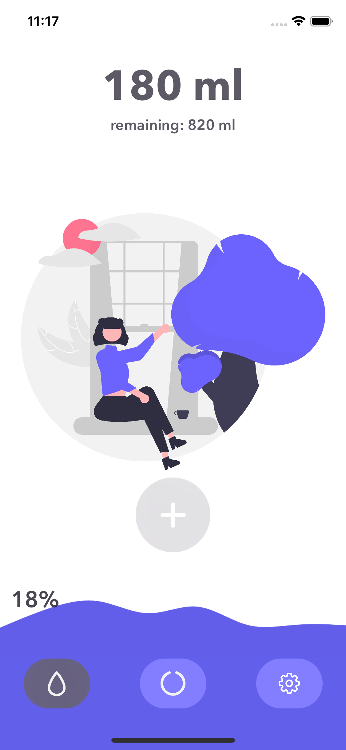
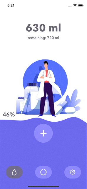
the first tab, this illustration is from this awesome artist: getronydesign
-
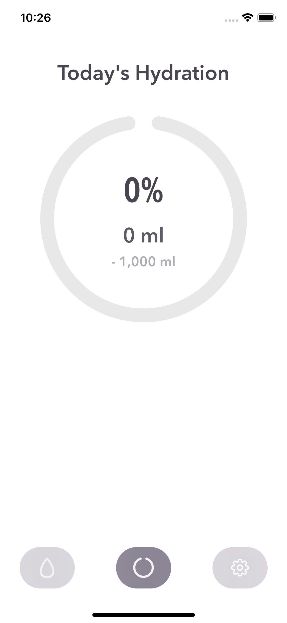
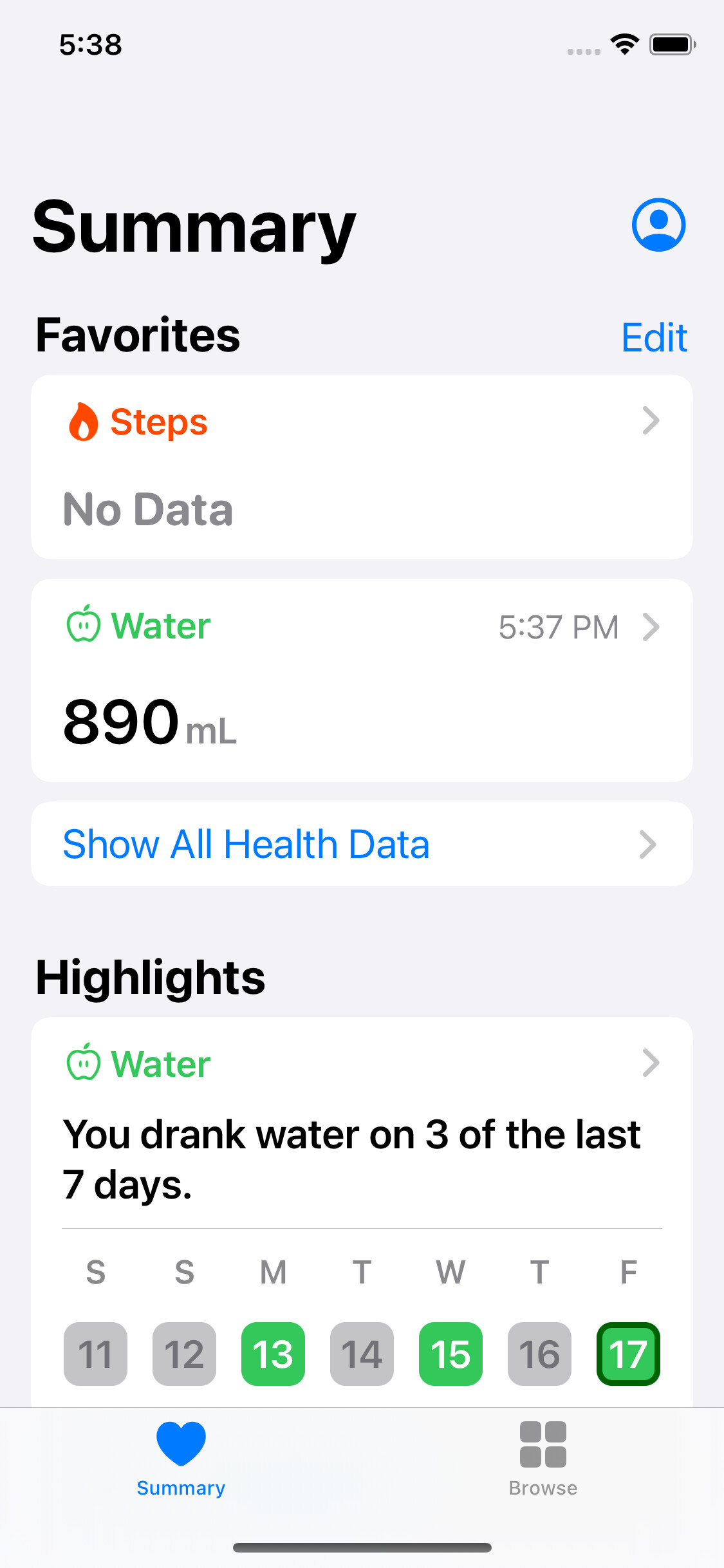
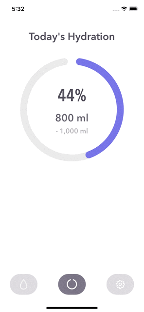
the second tab
-
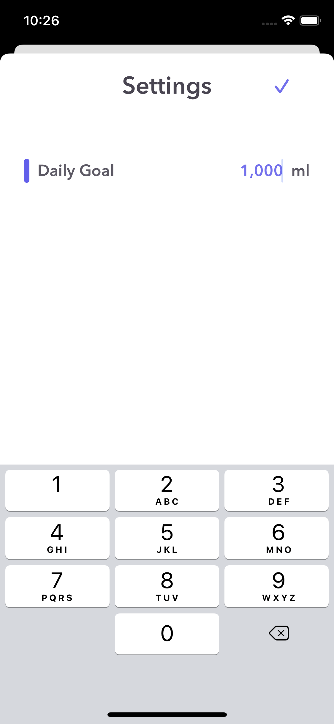
Settings
Hi, Codecrew! It’s been a while.
I started this challenge project a few days ago. Here are some screenshots of my work.
the first tab, this illustration is from this awesome artist: getronydesign
the second tab
Settings
Ooohh I love the graphics! 
So glad you liked it! I feel more passionate about this app : )
Have a look!
User can adjust the countdown duration.
Some other quirks(if not features)
textField.text being empty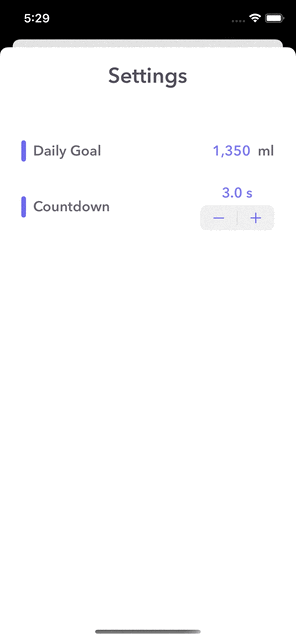
This looks really good
Thank you! 
This Demo App got approved for TestFlight, wanna have a try on this?
Named HydraBuddy, that’s where “HB” came from.
First of all: I really like it. Clean, nice design, does what it should do. The water consumption is added to the health app, perfect (I checked it for several days).
The graphics are fantastic, it’s kind of calming.
The (changing) wave is a brilliant idea.
Awesome 
May I give my opinion about some items, which may be optimized?
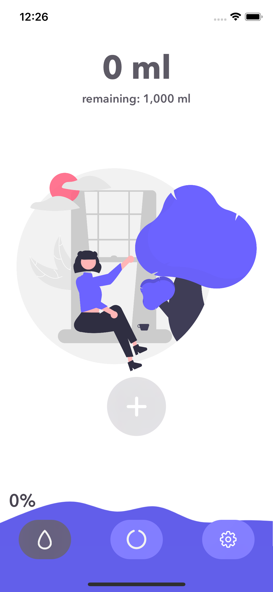
The percentage starts with 0% in the bottom left corner, right behind the tab icon. I would elevate it (just as you did with the 100% which stops below the overall progress indication).
As much as I like the plus icon to add 10ml (pressing several times to increase the intake, and the nice little twist with being able to modify the time till the intake is added to the overall amount) → if I drink a bottle of water I need to tap 50-70 times just to add one drink. This would prevent me from using the app in the future. Too complicated.
And then there are two minor design inconsistencies: The three buttons in the bottom row look like a Tab View, and this is true for the left and middle button, but it is not true for the right button (the settings), which is a sheet. (Why is it a sheet?) In this sheet, if you modify the daily goal, you need to confirm the change by tapping on a check mark. Whereas if you modify the countdown, you do not need to tap a check mark. Maybe adding the plus/minus buttons to the daily goal would be more consistent?
While working on my app I already know that your’s is more beautiful And your’s is flawlessly working
Bro, I much much appreciate how constructive these items are!
I will improve the following:
As for the daily goal textField inconsistency:
I really really appreciate you took your time writing all these precious items ; )
Today, following items were improved:

 Wanna try it out? Click here to join TestFlight!