This has been driving me crazy since I started with CodeWithChris back in October '21… my Navigator icons do not look like the thousands of other screenshots I come across… I’m on Xcode v13.2.1 on Mac OS Monterey 12.0.1.
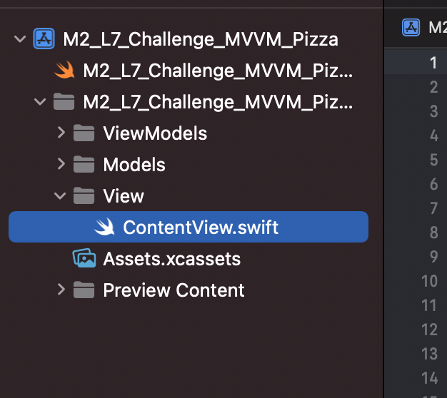
My Navigator pane looks like this:
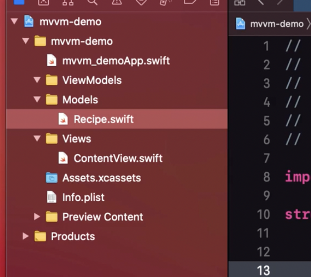
All the others look like this:
I’d much prefer to have the “normal” looking folders and triangles vs. the gray folders and carats.
It’s not a big deal at all; just cosmetic, but it’s driving me crazy since I cannot figure out how to change it.
I’m very new to the Mac OS world having been in a Windows/Visual Studio environment for many years.
I know it’s silly this bothers me… 
Any ideas? Thanks for listening…
What you are seeing is just the way the latest version of Xcode works. In time I am sure you will get used to it just like the rest of us.
Thank you Chris… that’s what I was afraid of.
Some of the changes include:
- Files that are .swift files now have an icon that it just the Swift Logo (makes sense).
- Folder icons now have a gray tone rather than yellow
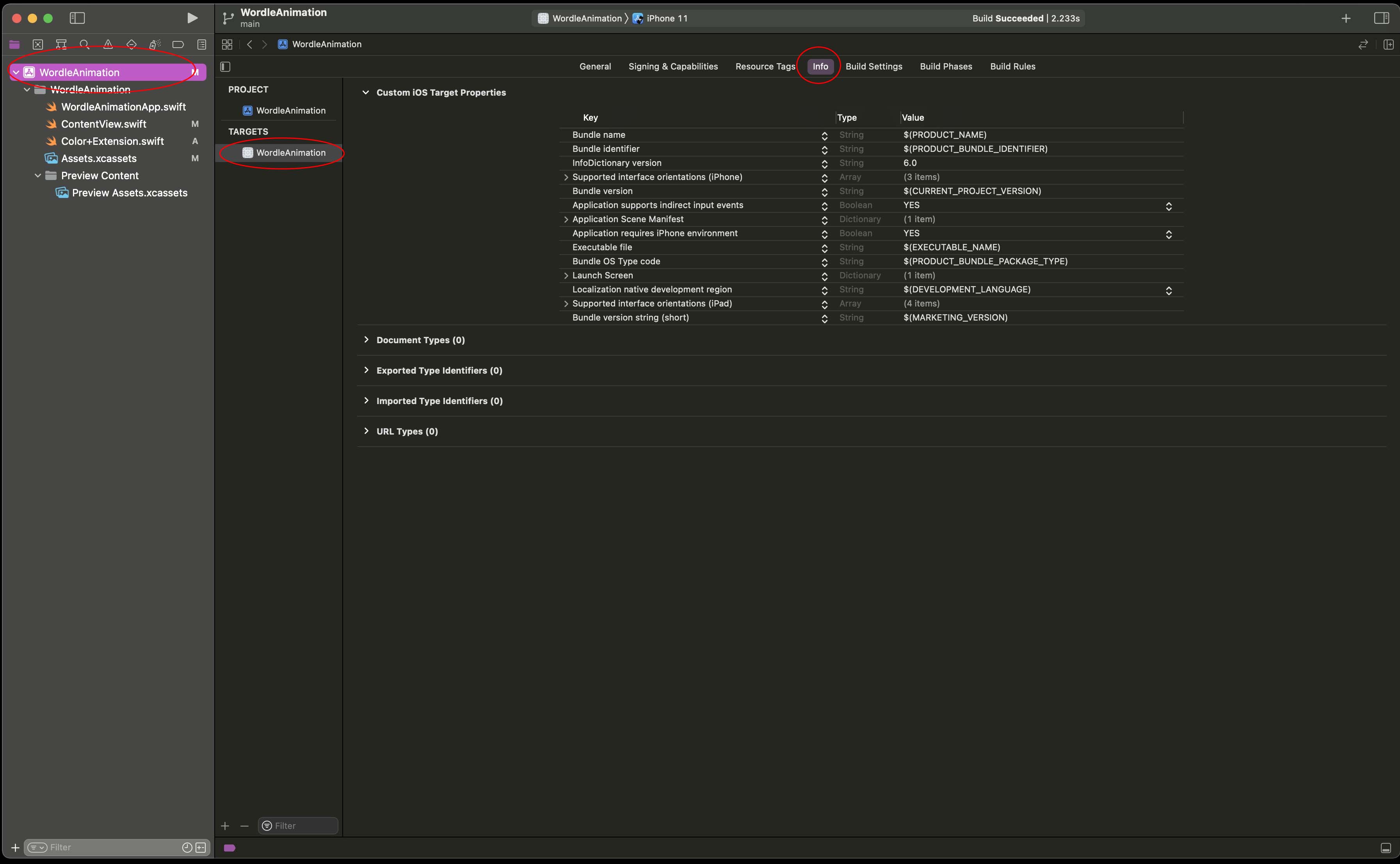
- The Info.plist file is no longer a separate file in the Project Navigator. It is now part of the .xcodeproj file and you can locate it as per this screenshot.
- If you open a project created in an earlier version of Xcode the Info.plist file will remain in the Project Navigator but will also appear as per the image above. They are the same so changes in one will appear in the other.
- The Assets.xcassets folder icon is different.
Chris, thank you. That’s good information to have going forward!