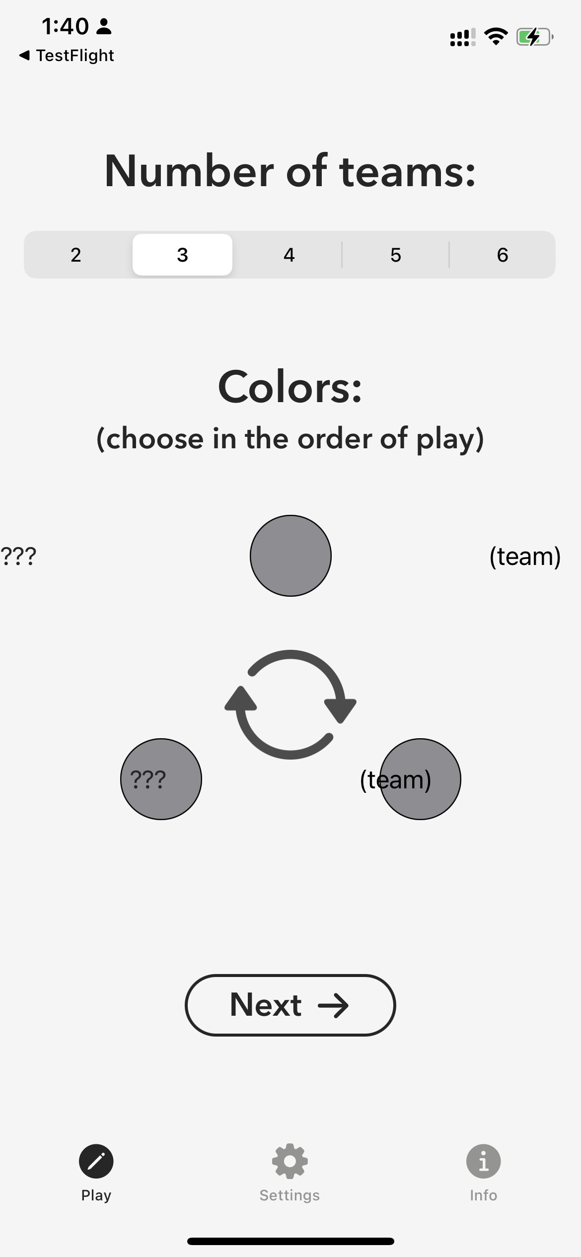
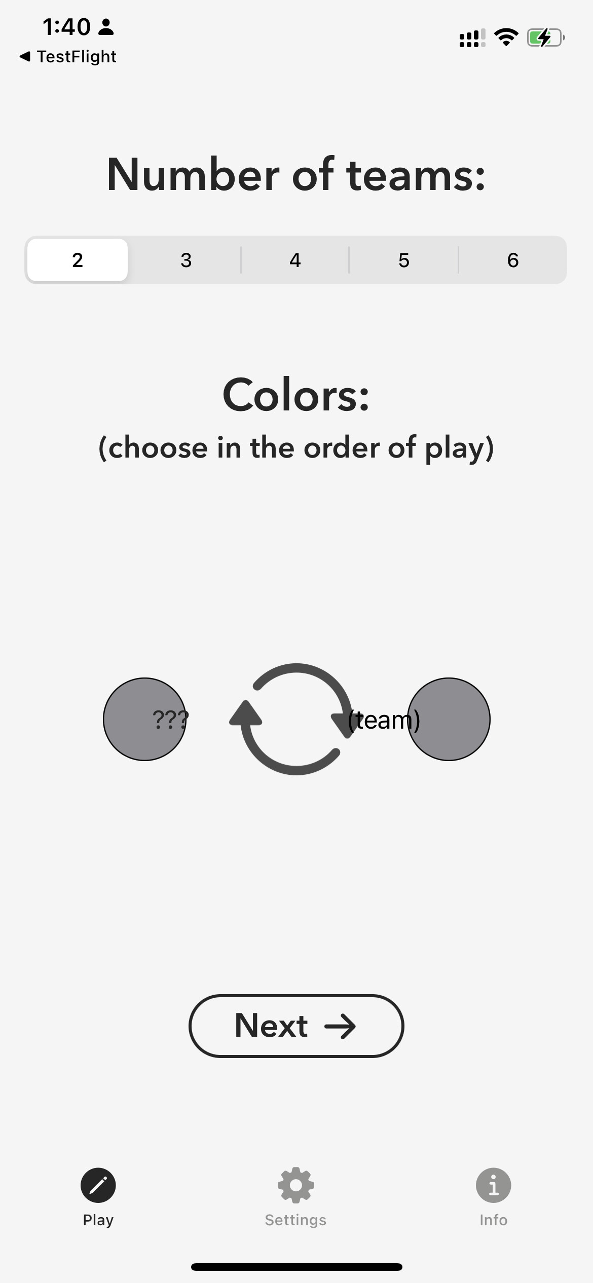
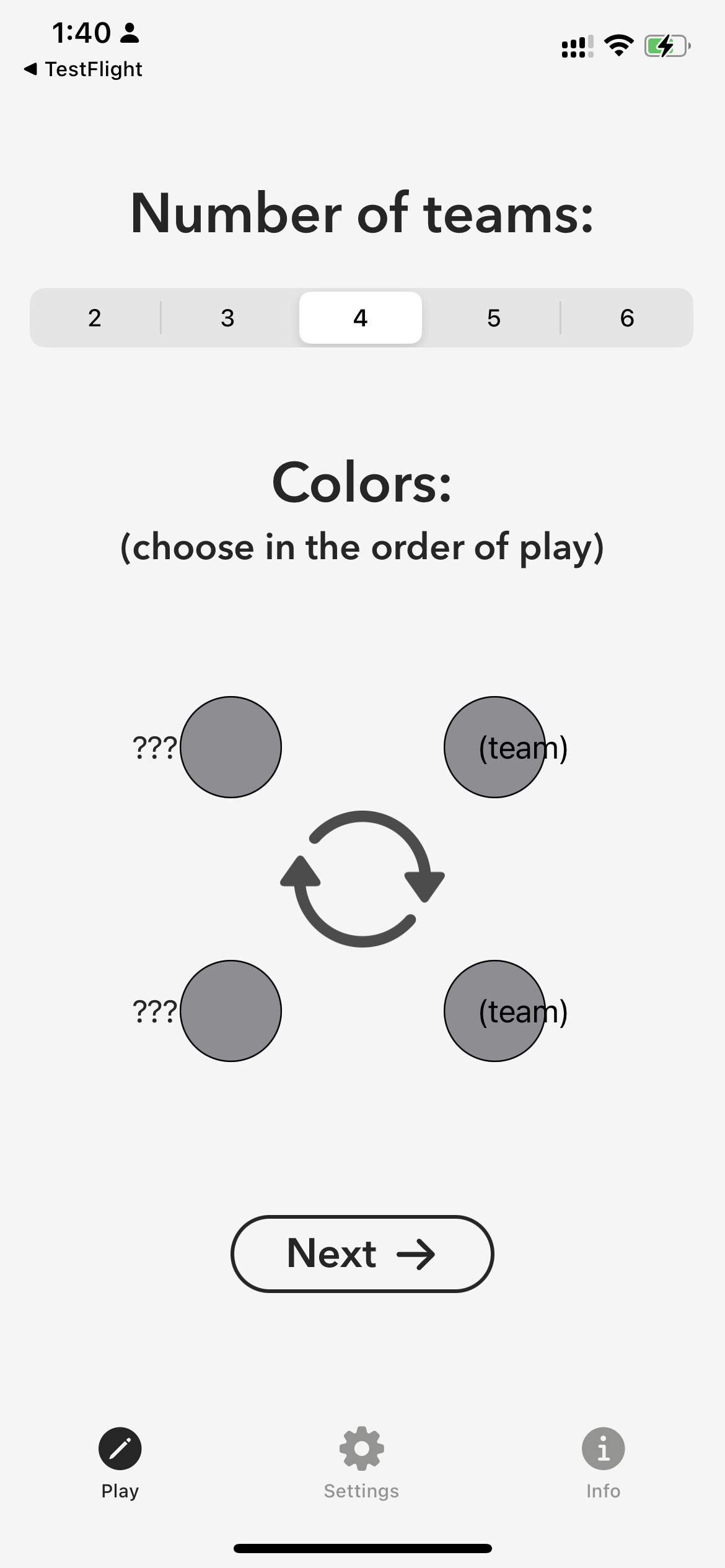
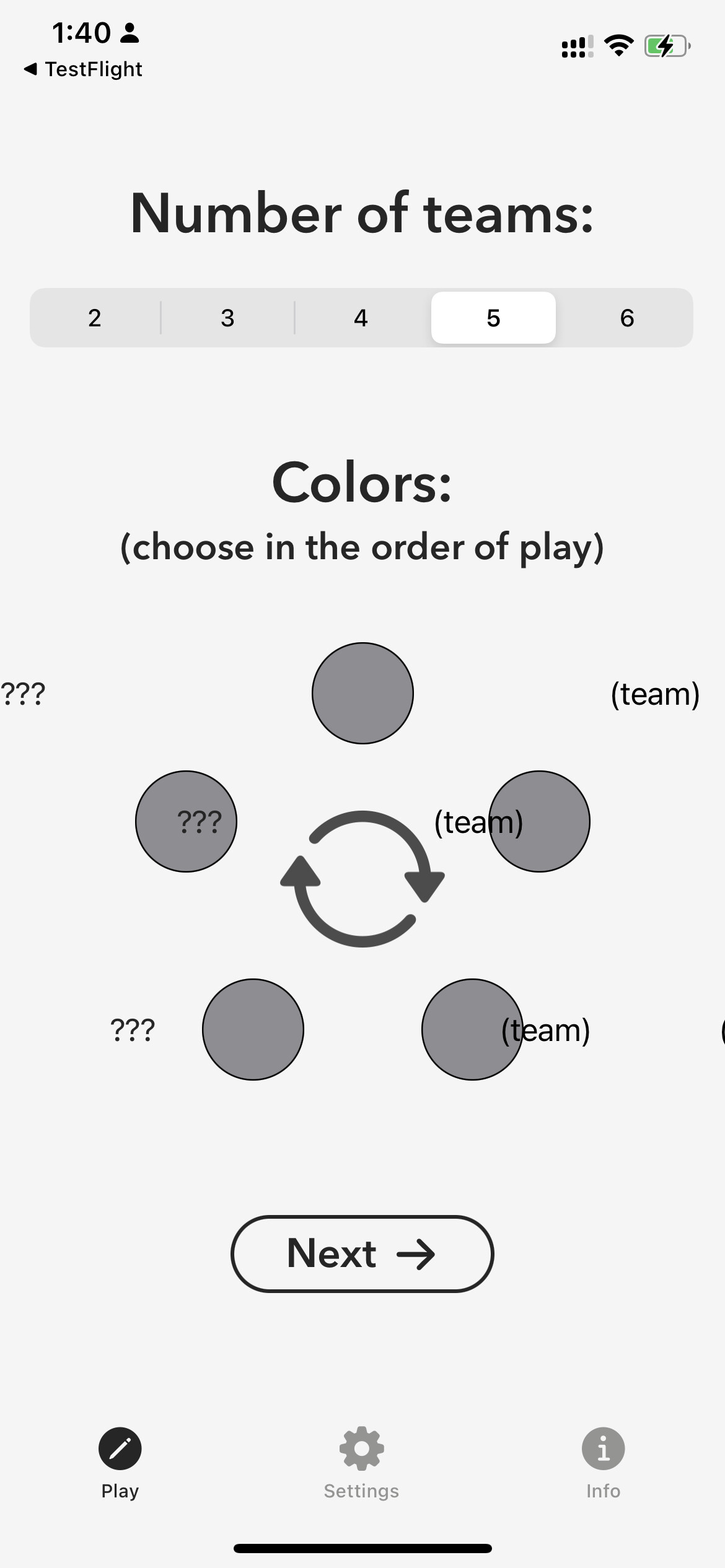
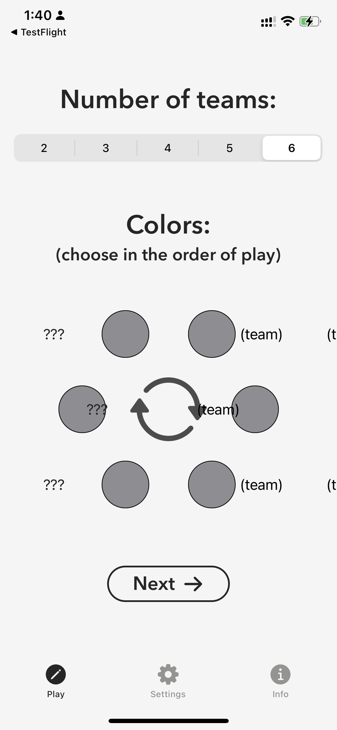
The first of two apps I’m planning to publish is available in TestFlight. It’s a game, similar to the board game Pictionary , where teams of two compete by guessing the word the other member is representing as a drawing. For this version, I reinvented the word categories and added a spinner. Feel free to test/check it out.
would love to give it a try! 
hi @Arron_E
I tried using the App, but unfortunately, I encountered a few bugs right away. I hope these screenshots and video recording is valuable to you! 

Maybe you want to combine the circle and text to a view and use that? It’s just a suggestion. 
@joash, thanks for giving it a try. This is the first I’ve seen of this. Are you on iOS 15?
The circle views are laid out behind the text views. Each text view is the content of a picker. I had wanted to combine the circle and the text in the same view, but was not able to use anything other than a text view for the picker content. I’ll have to explore that a little more. I used a geometry reader to position the circles and text with the same coordinates, so I’m not sure why they’re all ending up shifted to the right.
Other than the deployment target, the only thing I can think of is that I missed a device size when I made adjustments for the different sizes. What is your phone model?
Thanks again!
Forgot to mention, the three question marks are the picker labels, which don’t appear when I run it. The text that says (team) is the picker content.
I just learned that iOS 16 was made available yesterday, so I upgraded. Now I’m seeing the same thing as you. Looks like there must have been a change to how the label and content are laid out.
Apology for my late reply @Arron_E. Yes, I used iOS 16 to test the App you created.
I have a few recommendations if you don’t mind.
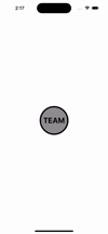
- Maybe It’s better if you use button than using gesture? Similar to the provided gif I provided for you below. It will provide a sense of familiarity for more users.
- Another is the implementation of the button to eliminate the issue of a broken UI. you can find the sample source code below the video.
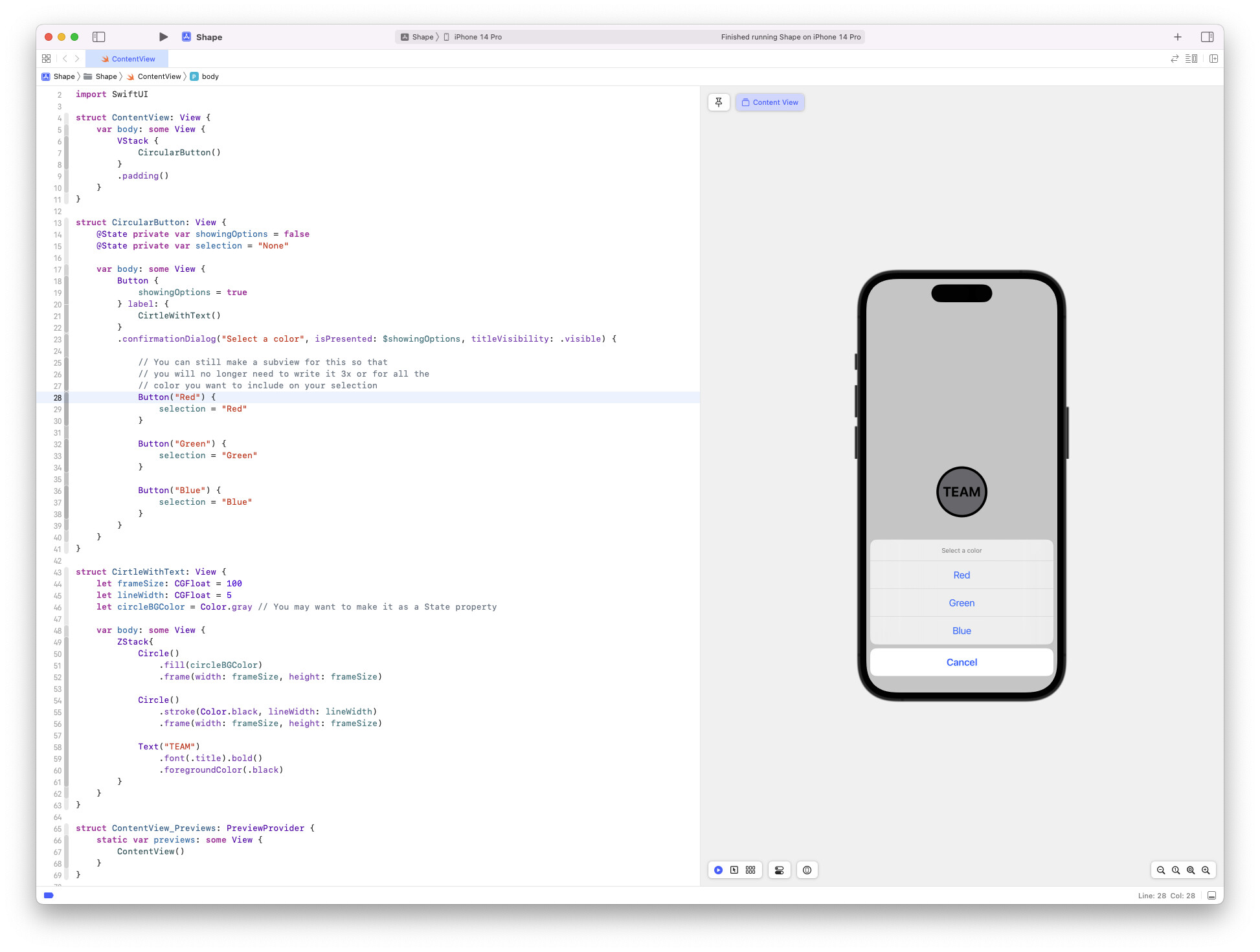
import SwiftUI

struct ContentView: View {
    var body: some View {
        VStack {
            CircularButton()
        }
        .padding()
    }
}

struct CircularButton: View {
    @State private var showingOptions = false
    @State private var selection = "None"

    var body: some View {
        Button {
            showingOptions = true
        } label: {
            CirtleWithText()
        }
        .confirmationDialog("Select a color", isPresented: $showingOptions, titleVisibility: .visible) {

            // You can still make a subview for this so that
            // you will no longer need to write it 3x or for all the
            // color you want to include on your selection
            Button("Red") {
                selection = "Red"
            }

            Button("Green") {
                selection = "Green"
            }

            Button("Blue") {
                selection = "Blue"
            }
        }
    }
}

struct CirtleWithText: View {
    let frameSize: CGFloat = 100
    let lineStroke: CGFloat = 5
    let circleBGColor = Color.gray // You may want to make it as a State property

    var body: some View {
        ZStack{
            Circle()
                .fill(circleBGColor)
                .frame(width: frameSize, height: frameSize)

            Circle()
                .stroke(Color.black, lineWidth: lineStroke)
                .frame(width: frameSize, height: frameSize)

            Text("TEAM")
                .font(.title).bold()
                .foregroundColor(.black)
        }
    }
}

struct ContentView_Previews: PreviewProvider {
    static var previews: some View {
        ContentView()
    }
}
Good luck bro!
Thanks, @joash, I see what you’re saying about a sense of familiarity, and I like your implementation. I’m hesitant to change the setup screen UI though, because there needs to be a button (circle) for every team within the same screen so that the user can select a unique color for each of the participating teams.
I expect to upload a new version to TestFlight today with fixes for iOS 16. Unfortunately, these fixes create problems for iOS 15. There seems to be an issue where the code I use for view transitions leads to different results between 15 and 16. This being the case, the minimum deployment for my new version will be iOS 16. I’ll let you know when it’s approved.
Let me know if you feel I’m missing anything in terms of the UI discussion.
I can’t tell @Arron_E it’s hard for me to provide any idea without seeing your code.
But in case, I would love to help you beta test your app.
Feel free to use the code sample it you want to.
1 Like
@joash Build #3 is available in TestFlight and should be  for iOS 16.
This is awesome @Arron_E!
The app is now working perfectly!
Thanks, that’s great to hear! @joash