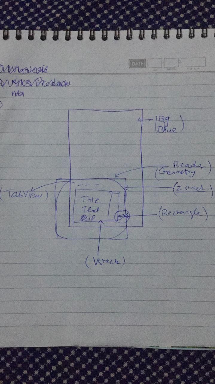
You’ve probably just got to make a few sketches on a pad to work out what elements you have in the View and how that View is structured.
At a glance you have a background of blue (obviously) and then a View on top with a white background which is offset to the bottom and to the left. So that’s an overall ZStack in which you have a VStack containing the other elements and it would appear to be offset by 2/3 of the screen height and maybe 1/5 of the screen width.
The question will be, what do you want to happen when you tap Skip or the red circle with the arrow?
An interesting challenge to make this look sensible in SwiftUI.
Have I got it right ?
also, the red circle when in Vstack is clipped. how can I make it appear over the right edge of the Vstack ?
The best thing to do now that you’ve got some idea of how you can put that together, is have a crack at creating the View.
You can add an .offset() modifier to that View element and push it to the right with an x: value that makes it look about right.
(edit) or you can use your geometryReader to position it on the right hand edge of your lower View
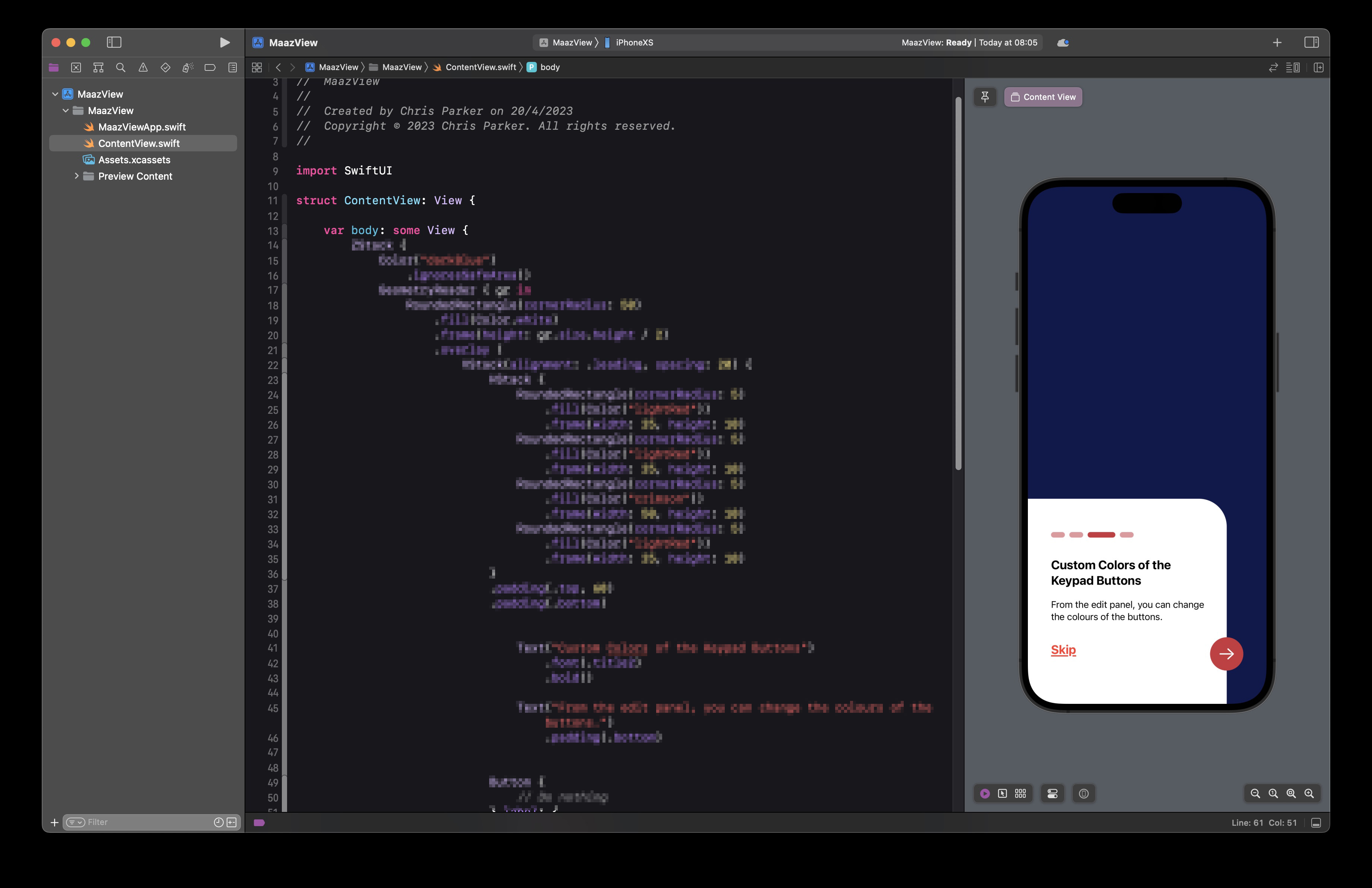
Here’s my take on the challenge. There was a lot of trial and error in doing this and the key point is that my solution is by no means the best way to go about it. Like all SwiftUI views there are dozens of ways to achieve a particular look. (I’ve pixelated the code in the image).
can you please share the code.
I tried as well. created a static design without tabview, but when I add tabview it breaks the layout. Here is what I have.
struct TestView: View {

    let active : Color = Color(#colorLiteral(red: 0.8, green: 0.2, blue: 0.24, alpha: 1))
    let inActive: Color =  Color(#colorLiteral(red: 0.9, green: 0.6, blue: 0.62, alpha: 1))

    var body: some View {
        GeometryReader{ g in
            ZStack{
                Rectangle()
                    .foregroundColor(.blue)

                ZStack{
                    Rectangle()
                        .foregroundColor(.white)
                        .cornerRadius(70, corners: .topRight)
                        .frame(height: 368)
                        .padding([.trailing],g.size.width * 0.15)

                    VStack (alignment: .leading, spacing: 25) {

                        HStack(spacing: 12) {
                            Capsule()
                                .foregroundColor(active)
                                .frame(width: 36.43, height: 6.83)

                            ForEach(0..<4) { index in
                                Capsule()
                                    .foregroundColor(inActive)
                                    .frame(width: 18.21, height: 6.83)
                            }
                        }

                        Text("Customize Your Keyboard with 1000+ Themes")
                            .font(.title)
                            .padding([.trailing],g.size.width * 0.15)

                        Text("You can change your keyboard from the existing or customize themes.")
                            .font(.body)
                            .padding([.trailing],g.size.width * 0.15)

                        HStack{
                            Text("Skip")
                                .font(.headline)
                                .fontWeight(.bold)


                            Spacer()

                            Image(systemName: "arrow.right")
                                .font(.system(size: 35))
                                .foregroundColor(Color.white)
                                .frame(width: 60, height: 60)
                                .background(active)
                                .clipShape(Circle())
                        }
                        .padding(.trailing)
                    }
                    .padding()
                    .padding(.leading)
                }
                .position(x: g.size.width * (1/2),y: g.size.height * 0.80)

            }
        }.ignoresSafeArea()
    }
}
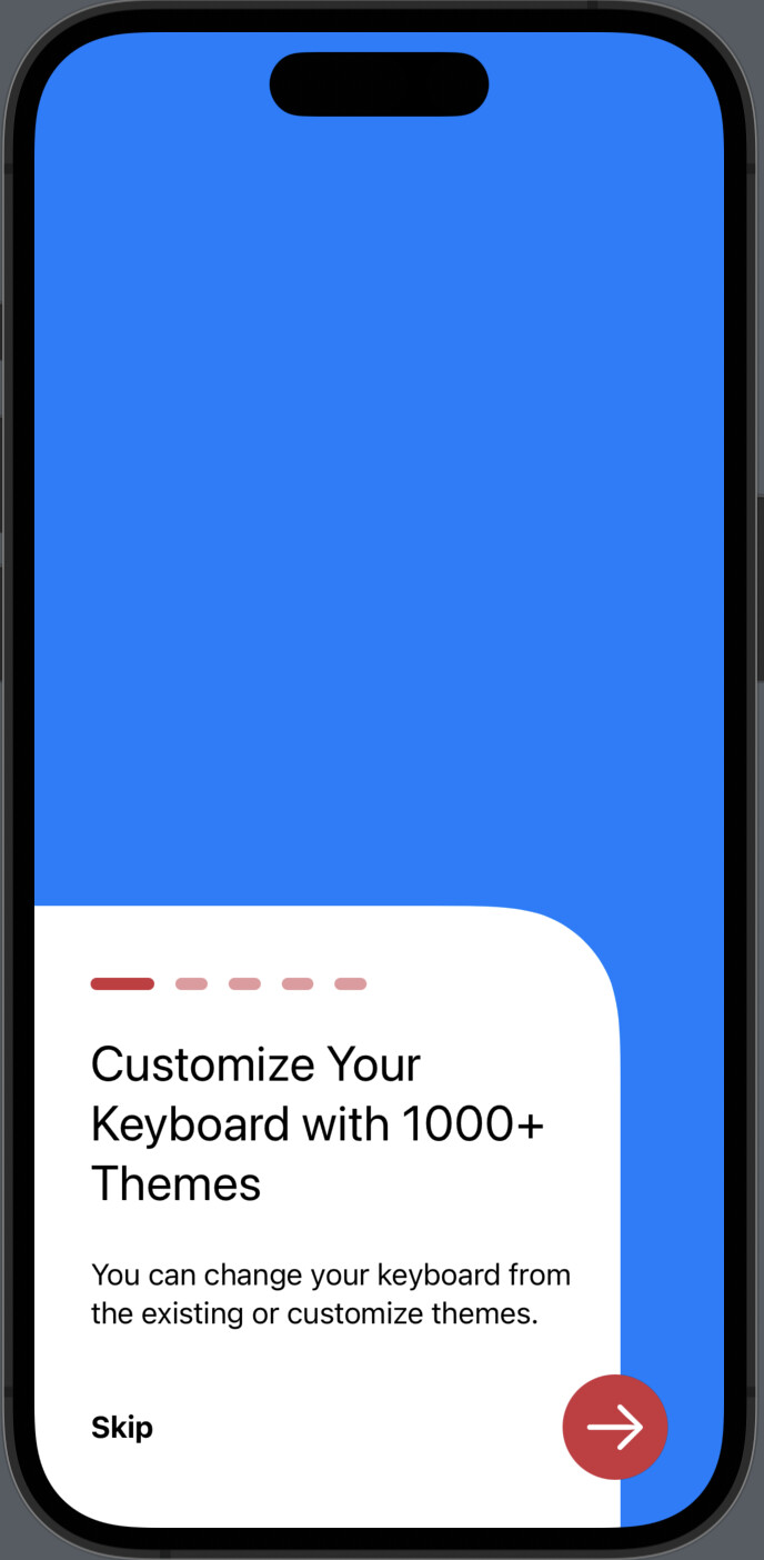
This wont work with a TabView since the TabView has Tab selection options at the bottom of the screen which take precedence. This kind of View suits perhaps a login View or a perhaps the beginnings of an OnBoarding view which would be shown before the TabView comes into play.
I did not attempt to place my solution amongst a TabView as I knew that it would not work. Nevertheless, this is my solution.
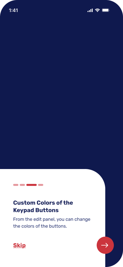
struct ContentView: View {

    var body: some View {
        ZStack {
            Color("darkBlue")
                .ignoresSafeArea()
            GeometryReader { gr in
                RoundedRectangle(cornerRadius: 50)
                    .fill(Color.white)
                    .frame(height: gr.size.height / 2)
                    .overlay (
                        VStack(alignment: .leading, spacing: 20) {
                            HStack {
                                RoundedRectangle(cornerRadius: 5)
                                    .fill(Color("lightRed"))
                                    .frame(width: 25, height: 10)
                                RoundedRectangle(cornerRadius: 5)
                                    .fill(Color("lightRed"))
                                    .frame(width: 25, height: 10)
                                RoundedRectangle(cornerRadius: 5)
                                    .fill(Color("crimson"))
                                    .frame(width: 50, height: 10)
                                RoundedRectangle(cornerRadius: 5)
                                    .fill(Color("lightRed"))
                                    .frame(width: 25, height: 10)
                            }
                            .padding(.top, 60)
                            .padding(.bottom)


                                Text("Custom Colors of the Keypad Buttons")
                                    .font(.title2)
                                    .bold()

                                Text("From the edit panel, you can change the colours of the buttons.")
                                    .padding(.bottom)


                            Button {
                                // Do nothing
                            } label: {
                                Text("Skip")
                                    .font(.title2)
                                    .bold()
                                    .underline(pattern: .solid)
                            }
                            .foregroundColor(.red)

                            Spacer()
                        }
                            .padding(.trailing, 30)
                            .padding(.leading, gr.size.width / 4)
                    )
                    .overlay (
                        ZStack {
                            Circle().fill(Color("crimson"))
                            Image(systemName: "arrow.right")
                                .resizable()
                                .foregroundColor(.white)
                                .padding(.horizontal, 17)
                                .padding(.vertical, 20)
                        }
                            .frame(width: 60, height: 60)
                            .position(x: gr.size.width, y: gr.size.height / 3)
                    )
                    .position(x: gr.size.width * 1 / 3, y: gr.size.height * 0.85)
            }
        }
    }
}

struct ContentView_Previews: PreviewProvider {
    static var previews: some View {
        ContentView()
    }
}
crimson, lightRed and darkBlue are colour defined as Color Sets in the Assets Catalogue
Settings for the colors in Hexadecimal are
crimson #CB343D
lightRed #E5989E
darkBlue #0F194E