Hello there! I edited the War Card Game app to have a bunch of new features. However, I’m struggling to make the app scale to smaller iPhones. It looks just fine on the iPhones with the notch, but smaller ones like the SE 2nd gen and the iPhone 8 push the buttons and content off the screen.
Am I missing something? I’m just using things like HStack VStack and Spacers to spread things out at the moment. I can provide code if needed. (Every image used as a button or otherwise has all 3 sizes in my assets folder)

The way I got around this issue was to use an Environment variable to interrogate the vertical size class and then adjust Stack spacing parameter or whether to use a Spacer() between some of the elements at all.
So at the top I declared the following:
@Environment(\.verticalSizeClass) var sizeClass
Then I declared a computed value to determine if the device was oriented in portrait mode or landscape like this:
    var portrait: Bool {
        sizeClass != .compact ? true : false
    }
I then used portrait as a ternary operator to switch the VStack or HStack spacing accordingly. For example:
VStack(spacing: portrait ? 20 : 5)
When it came to choosing whether or not to use a spacer I did something like this:
if sizeClass != .compact {
    Spacer()
}
Hope that gives you an idea or two.
Thank you for the quick reply! I think this went a little over my head as I am very much a beginner. I’m a little lost as to how to implement this in my code.
Yeah I should have thought about that prior to posting. I have been using SwifUI for a while now.
Here is the ContentView.swift file if you want to have a look though what I did.
Ok cool! So it looks like there are a few different things you did to account for phone size. How do you go about determining the best numbers for those ratios? It looks like you have them for both images within “.frame” and also for spacing in the stacks.
It was trial an error really until the values I came up with worked on all devices apart from the iPod Touch which I really was not concerned about at all.
That makes sense. Is that image bounce variable important in my case do you think?
Nah, I was just messing around using that to indicate when the two cards were the same.
gotcha thank you for all your help! I’ll mess around a bit more and see if I can’t make this work haha
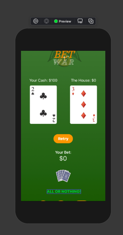
In your version you have a lot of elements in the vertical plane which becomes a problem when you have a small device and that’s just because it’s a struggle to get them all to fit. I think layout design is the challenge and keeping the UI simple is the key. As they say in many fields, “Less is more”.
For sure! so maybe part of my solution will be just condensing and adjusting the overall layout
Yeah, just keep experimenting because that’s the way you learn how to come up with different layouts.
1 Like