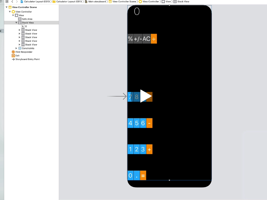
So I’m following along in this bootcamp and all I did for the stack view was change the constraints to 0 just like I was told and for some reason the bottom numbers and symbols stretched long vertically. I’ll put a side by side comparison

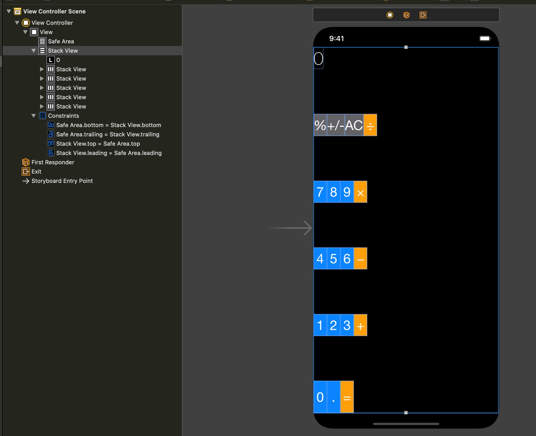
Can you show the Document Outline expanded so that all the stackViews are visible?
And show the constraints that have been applied to the overall StackView.
It’s also possible that the StackView option “Fill Proportionally” has been selected which means that depending on the initial position of the other stackViews, one of them will get stretched to comply with the proportional option.
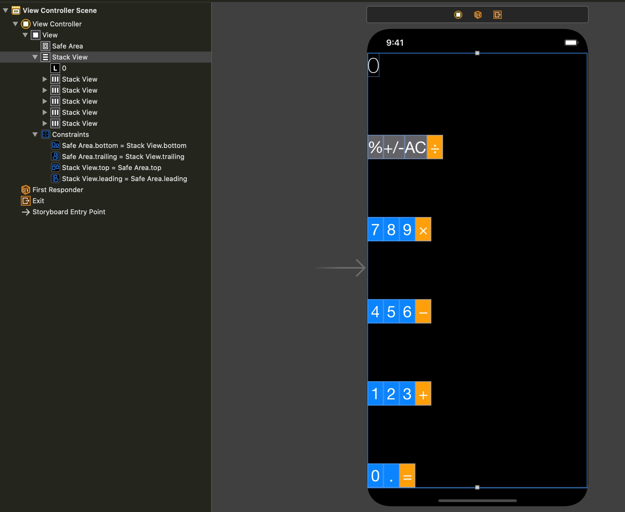
Sorry David, I edited my original post because I realised that I didn’t notice initially that the stackView immediately under the Safe Area is not expanded meaning that you can’t see the other stackViews inside it.
I also edited the post to include:
It’s also possible that the StackView option “Fill Proportionally” has been selected which means that depending on the initial position of the other stackViews, one of them will get stretched to comply with the proportional option. This is what that did to mine. You can just see that the bottom group have been stretched.
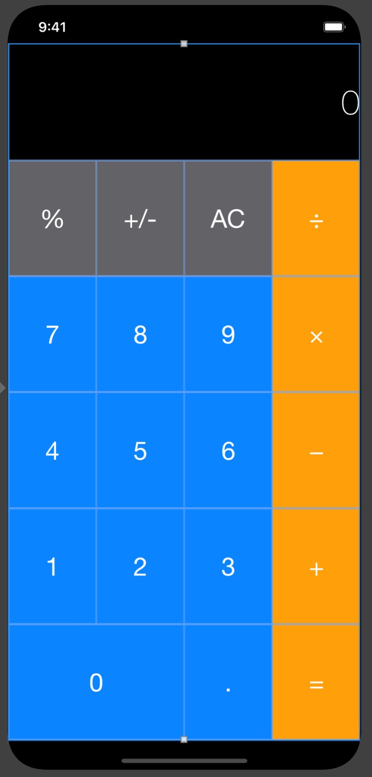
So by setting it to “fill equally” you get it to look like this.
I suspect that as you follow along, eventually some more constraints are going to be applied that enlarge the individual buttons and then the whole UI will take on a better look.
This may be what the UI will look like … purely a guess on my part as I have no idea of what the tutorial contains.
So far so good, thanks!
1 Like