Hi there again,
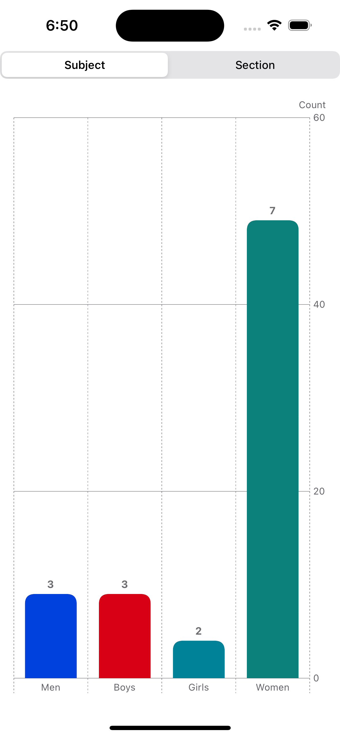
I’ve run into another wall, I am trying to get my graph to reflect the colors present in entryObservation.subject.color but if I use a simple .foregroundStyle(entryObservation.subject.name) then the legend doesn’t show, and if I use .foregroundStyle(by: .value("Subject", entryObservation.subject.name)) then the chart doesn’t reflect the color in my data.
I have done some digging and it appears that I may need to use chartForegroundStyleScale(mapping:) but I’m pretty lost on how to do that. Keep in mind the data is dynamic and the code needs to support this so .chartForegroundStyleScale(["Men": .blue, "Boys": .red, "Girls": .teal, "Women": .mint]) won’t work.
Is this even the right route to go down or should I just build a custom legend?
Any help would be greatly appreciated,
Josh
import SwiftUI
import Charts

struct EntryObservation {
    var subject: Subject
    var sectionGroup: SectionGroup
    var time: Date
}

struct Subject {
    var name: String
    var color: Color
}

struct SectionGroup {
    var name: String
}

struct ClickerView: View {
    var entryObservations: [EntryObservation]
    @State private var categorization = 1
    var body: some View {
        Chart (entryObservations, id: \.time) {entryObservation in
            Plot {
                switch categorization {
                case 2:
                    BarMark(x: .value("Section", entryObservation.sectionGroup.name), y: .value("Count", entryObservations.filter { $0.sectionGroup.name == entryObservation.sectionGroup.name }.count))
                        .foregroundStyle(by: .value("Subject", entryObservation.subject.name))
                        .cornerRadius(10)
                        .annotation(position: .top) {
                            Text("\(entryObservations.filter { $0.sectionGroup.name == entryObservation.sectionGroup.name }.count)")
                                .foregroundColor(Color.gray)
                                .font(.system(size: 12, weight: .bold))
                        }
                default:
                    BarMark(x: .value("Subject", entryObservation.subject.name), y: .value("Count", entryObservations.filter { $0.subject.name == entryObservation.subject.name }.count))
                        .cornerRadius(10)
                        .foregroundStyle(by: .value("Subject", entryObservation.subject.name))
                        .annotation(position: .top) {
                            Text("\(entryObservations.filter { $0.subject.name == entryObservation.subject.name }.count)")
                                .foregroundColor(Color.gray)
                                .font(.system(size: 12, weight: .bold))
                        }
                }
            }
        }.padding()
            .chartYAxisLabel("Count")
            .safeAreaInset(edge: .top) {
                VStack {
                    Picker("Categorisation", selection: $categorization) {
                        Text("Subject").tag(1)
                        Text("Section").tag(2)
                    }
                    .pickerStyle(.segmented)
                }
            }
    }
}

let entryObservations: [EntryObservation] = [
    EntryObservation(subject: Subject(name: "Men", color: .blue), sectionGroup: SectionGroup(name: "School"), time: Date(timeIntervalSince1970: 1000)),
    EntryObservation(subject: Subject(name: "Men", color: .blue), sectionGroup: SectionGroup(name: "School"), time: Date(timeIntervalSince1970: 1300)),
    EntryObservation(subject: Subject(name: "Men", color: .blue), sectionGroup: SectionGroup(name: "Mall"), time: Date(timeIntervalSince1970: 2000)),
    EntryObservation(subject: Subject(name: "Boys", color: .red), sectionGroup: SectionGroup(name: "School"), time: Date(timeIntervalSince1970: 1900)),
    EntryObservation(subject: Subject(name: "Boys", color: .red), sectionGroup: SectionGroup(name: "Mall"), time: Date(timeIntervalSince1970: 2200)),
    EntryObservation(subject: Subject(name: "Boys", color: .red), sectionGroup: SectionGroup(name: "School"), time: Date(timeIntervalSince1970: 2500)),
    EntryObservation(subject: Subject(name: "Girls", color: .teal), sectionGroup: SectionGroup(name: "Mall"), time: Date(timeIntervalSince1970: 2800)),
    EntryObservation(subject: Subject(name: "Girls", color: .teal), sectionGroup: SectionGroup(name: "School"), time: Date(timeIntervalSince1970: 3100)),
    EntryObservation(subject: Subject(name: "Women", color: .mint), sectionGroup: SectionGroup(name: "Mall"), time: Date(timeIntervalSince1970: 3400)),
    EntryObservation(subject: Subject(name: "Women", color: .mint), sectionGroup: SectionGroup(name: "Mall"), time: Date(timeIntervalSince1970: 3700)),
    EntryObservation(subject: Subject(name: "Women", color: .mint), sectionGroup: SectionGroup(name: "School"), time: Date(timeIntervalSince1970: 4000)),
    EntryObservation(subject: Subject(name: "Women", color: .mint), sectionGroup: SectionGroup(name: "Mall"), time: Date(timeIntervalSince1970: 4300)),
    EntryObservation(subject: Subject(name: "Women", color: .mint), sectionGroup: SectionGroup(name: "School"), time: Date(timeIntervalSince1970: 4600)),
    EntryObservation(subject: Subject(name: "Women", color: .mint), sectionGroup: SectionGroup(name: "Mall"), time: Date(timeIntervalSince1970: 4900)),
    EntryObservation(subject: Subject(name: "Women", color: .mint), sectionGroup: SectionGroup(name: "School"), time: Date(timeIntervalSince1970: 5200))

]

#Preview {
    ClickerView(entryObservations: entryObservations)
}

