SwiftUI Charts Y axis Scale Not Reflecting Data

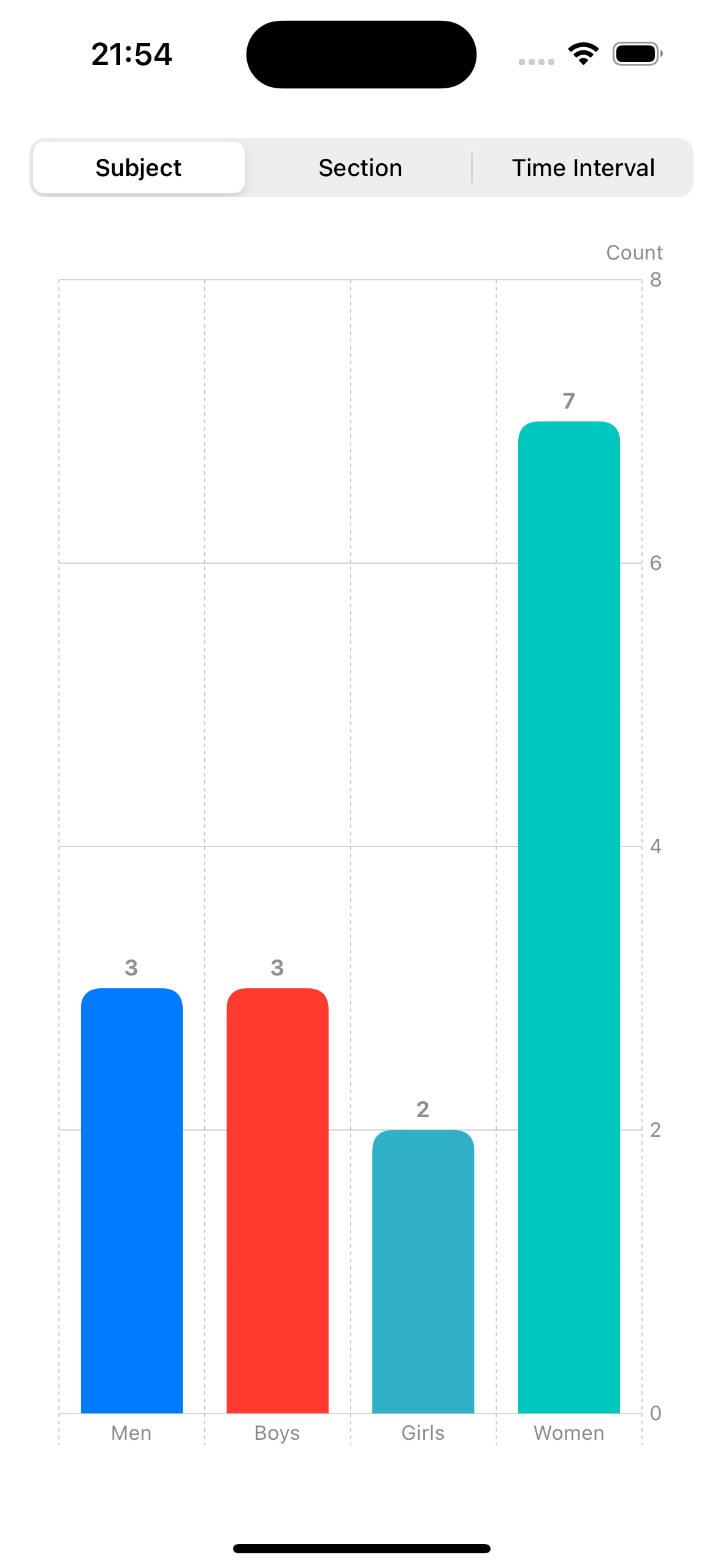
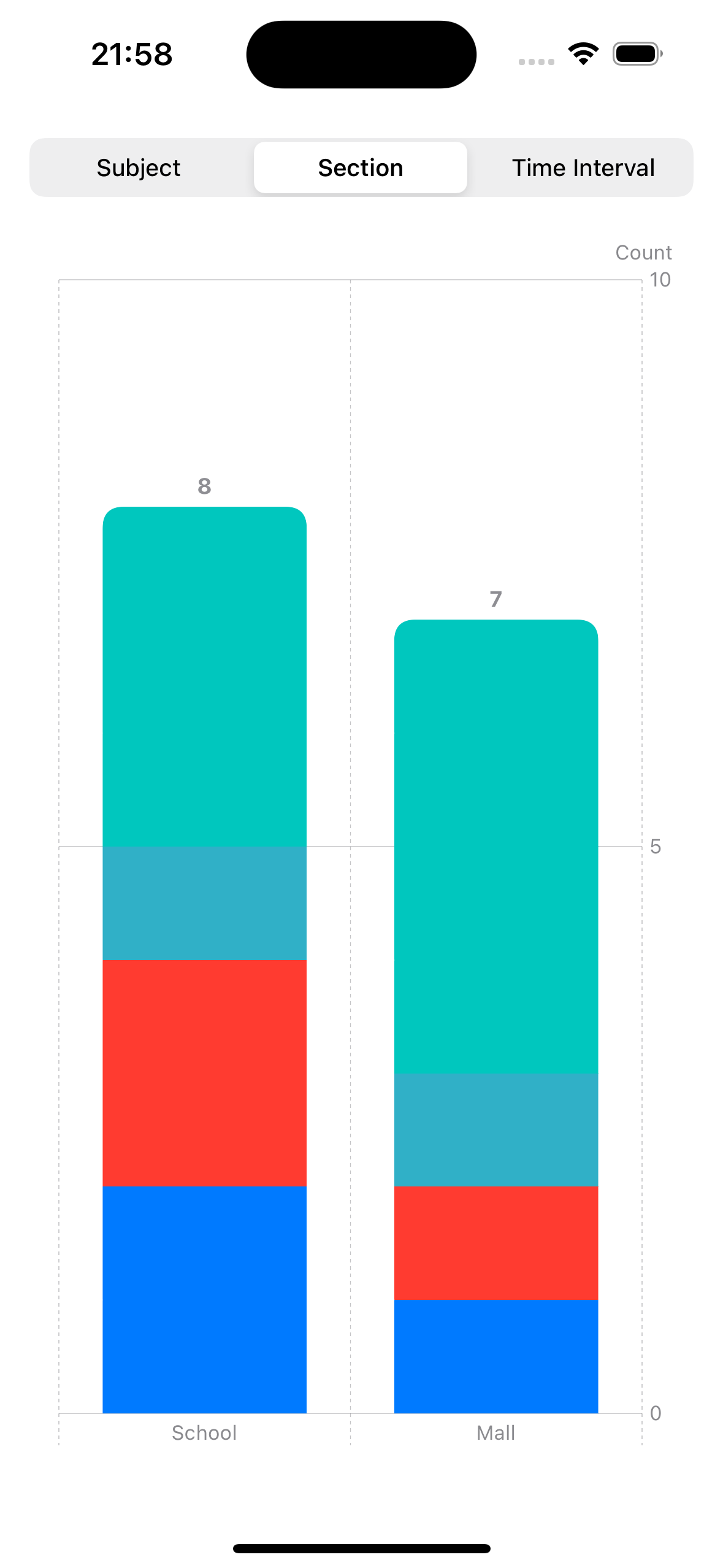
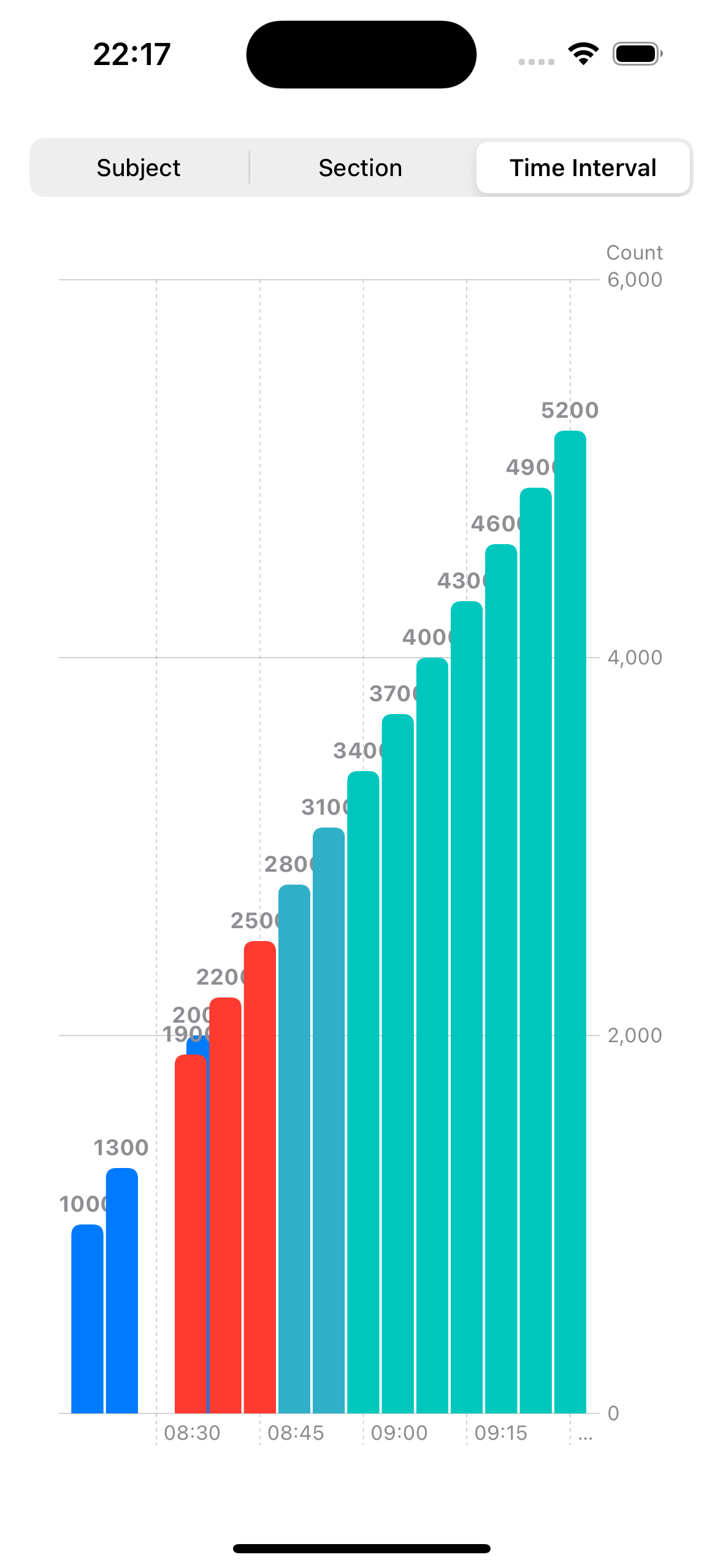
Hi there, I just thought I’d learn Swift Charts and I’m having an issue where the y axis scale is displaying numbers well into the hundreds while the chart annotation and sample data proves that there aren’t that many. See attached images:

Code is below ↓
Thanks,
Josh

import SwiftUI
import Charts

struct EntryObservation {
    var subject: Subject
    var sectionGroup: SectionGroup
    var time: Date
}

struct Subject {
    var name: String
    var color: Color
}

struct SectionGroup {
    var name: String
}

struct ClickerView: View {
    var entryObservations: [EntryObservation]
    @State private var categorization = 1
    var body: some View {
        Chart (entryObservations, id: \.time) {entryObservation in
            Plot {
            switch categorization {
            case 2:
                BarMark(x: .value("Section", entryObservation.sectionGroup.name), y: .value("Count", entryObservations.filter { $0.sectionGroup.name == entryObservation.sectionGroup.name }.count))
                    .foregroundStyle(entryObservation.subject.color)
                    .cornerRadius(10)
                    .annotation(position: .top) {
                        Text("\(entryObservations.filter { $0.sectionGroup.name == entryObservation.sectionGroup.name }.count)")
                            .foregroundColor(Color.gray)
                            .font(.system(size: 12, weight: .bold))
                    }
            case 3:
                let count = entryObservations.filter {
                                let timeInterval = entryObservation.time.timeIntervalSince($0.time)
                                return timeInterval >= 0 && timeInterval < 400
                            }.count
                BarMark(x: .value("Time", entryObservation.time ..< entryObservation.time.advanced(by: 400)), y: .value("Count", count))
                    .cornerRadius(5)
                    .foregroundStyle(entryObservation.subject.color)
            default:
                BarMark(x: .value("Subject", entryObservation.subject.name), y: .value("Count", entryObservations.filter { $0.subject.name == entryObservation.subject.name }.count))
                    .cornerRadius(10)
                    .foregroundStyle(entryObservation.subject.color)
                    .annotation(position: .top) {
                        Text("\(entryObservations.filter { $0.subject.name == entryObservation.subject.name }.count)")
                            .foregroundColor(Color.gray)
                            .font(.system(size: 12, weight: .bold))
                    }
            }
        }
        }.padding()
            .chartYAxisLabel("Count")
            .chartLegend(categorization == 2 ? .visible : .hidden)
            .chartLegend(position: .top)
            .safeAreaInset(edge: .top) {
                VStack {
                    Picker("Categorisation", selection: $categorization) {
                        Text("Subject").tag(1)
                        Text("Section").tag(2)
                        Text("Time Interval").tag(3)
                    }
                    .pickerStyle(.segmented)
                }
            }
    }
}

let entryObservations: [EntryObservation] = [
    EntryObservation(subject: Subject(name: "Men", color: .blue), sectionGroup: SectionGroup(name: "School"), time: Date(timeIntervalSince1970: 1000)),
    EntryObservation(subject: Subject(name: "Men", color: .blue), sectionGroup: SectionGroup(name: "School"), time: Date(timeIntervalSince1970: 1300)),
    EntryObservation(subject: Subject(name: "Men", color: .blue), sectionGroup: SectionGroup(name: "Mall"), time: Date(timeIntervalSince1970: 2000)),
    EntryObservation(subject: Subject(name: "Boys", color: .red), sectionGroup: SectionGroup(name: "School"), time: Date(timeIntervalSince1970: 1900)),
    EntryObservation(subject: Subject(name: "Boys", color: .red), sectionGroup: SectionGroup(name: "Mall"), time: Date(timeIntervalSince1970: 2200)),
    EntryObservation(subject: Subject(name: "Boys", color: .red), sectionGroup: SectionGroup(name: "School"), time: Date(timeIntervalSince1970: 2500)),
    EntryObservation(subject: Subject(name: "Girls", color: .teal), sectionGroup: SectionGroup(name: "Mall"), time: Date(timeIntervalSince1970: 2800)),
    EntryObservation(subject: Subject(name: "Girls", color: .teal), sectionGroup: SectionGroup(name: "School"), time: Date(timeIntervalSince1970: 3100)),
    EntryObservation(subject: Subject(name: "Women", color: .mint), sectionGroup: SectionGroup(name: "Mall"), time: Date(timeIntervalSince1970: 3400)),
    EntryObservation(subject: Subject(name: "Women", color: .mint), sectionGroup: SectionGroup(name: "Mall"), time: Date(timeIntervalSince1970: 3700)),
    EntryObservation(subject: Subject(name: "Women", color: .mint), sectionGroup: SectionGroup(name: "School"), time: Date(timeIntervalSince1970: 4000)),
    EntryObservation(subject: Subject(name: "Women", color: .mint), sectionGroup: SectionGroup(name: "Mall"), time: Date(timeIntervalSince1970: 4300)),
    EntryObservation(subject: Subject(name: "Women", color: .mint), sectionGroup: SectionGroup(name: "School"), time: Date(timeIntervalSince1970: 4600)),
    EntryObservation(subject: Subject(name: "Women", color: .mint), sectionGroup: SectionGroup(name: "Mall"), time: Date(timeIntervalSince1970: 4900)),
    EntryObservation(subject: Subject(name: "Women", color: .mint), sectionGroup: SectionGroup(name: "School"), time: Date(timeIntervalSince1970: 5200))

]

#Preview {
    ClickerView(entryObservations: entryObservations)
}

@The-Wolf

Charts are something I am delving into at the moment so I am not a full bottle on the subject. I have had a bit of a play with your code and from what I have learned or discovered is that for the y: axis, Charts is keeping track of the count internally (somehow) such that it figures out the peak value on the y: axis.

Here is your code after me hacking into it. First up I have rearranged some things to make is easier for me and I hope you don’t mind me taking the liberty of doing so:

import SwiftUI
import Charts

struct EntryObservation {
    var subject: Subject
    var sectionGroup: SectionGroup
    var time: Date
}

struct Subject {
    var name: String
    var color: Color
}

struct SectionGroup {
    var name: String
}

struct ClickerView: View {
    @State private var entryObservations = [EntryObservation]()
    @State private var categorization = 1
    @State private var baseDate = Date(timeIntervalSince1970: 0)

    var body: some View {
        Chart (entryObservations, id: \.time) { entryObservation in
            Plot {
                switch categorization {
                case 2:
                    // Section
                    BarMark(x: .value("Section", entryObservation.sectionGroup.name), y: .value("Count", 1))
                        .foregroundStyle(entryObservation.subject.color)
                        .cornerRadius(10)
                        .annotation(position: .top) {
                            Text("\(entryObservations.filter { $0.sectionGroup.name == entryObservation.sectionGroup.name }.count)")
                                .foregroundColor(Color.gray)
                                .font(.system(size: 12, weight: .bold))
                        }
                case 3:
                    // Time Interval
                    BarMark(x: .value("Time", entryObservation.time ..< entryObservation.time.advanced(by: 400)), y: .value("", Int(entryObservation.time.timeIntervalSince(baseDate))))
                        .cornerRadius(5)
                        .foregroundStyle(entryObservation.subject.color)
                        .annotation(position: .top) {
                            Text(String(Int(entryObservation.time.timeIntervalSince(baseDate))))
                                .foregroundColor(Color.gray)
                                .font(.system(size: 12, weight: .bold))
                        }

                default:
                    // Subject
                    BarMark(x: .value("Subject", entryObservation.subject.name), y: .value("Count", 1))
                        .cornerRadius(10)
                        .foregroundStyle(entryObservation.subject.color)
                        .annotation(position: .top) {
                            Text("\(entryObservations.filter { $0.subject.name == entryObservation.subject.name }.count)")
                                .foregroundColor(Color.gray)
                                .font(.system(size: 12, weight: .bold))
                        }

                }
            }
        }
        .onAppear {
            populateData()
        }
        .padding()
        .chartYAxisLabel("Count")
        .chartLegend(categorization == 2 ? .visible : .hidden)
        .chartLegend(position: .top)
        .safeAreaInset(edge: .top) {
            VStack {
                Picker("Categorisation", selection: $categorization) {
                    Text("Subject").tag(1)
                    Text("Section").tag(2)
                    Text("Time Interval").tag(3)
                }
                .pickerStyle(.segmented)
            }
        }
    }

    func populateData() {
        entryObservations = [
            EntryObservation(subject: Subject(name: "Men", color: .blue), sectionGroup: SectionGroup(name: "School"), time: Date(timeIntervalSince1970: 1000)),
            EntryObservation(subject: Subject(name: "Men", color: .blue), sectionGroup: SectionGroup(name: "School"), time: Date(timeIntervalSince1970: 1300)),
            EntryObservation(subject: Subject(name: "Men", color: .blue), sectionGroup: SectionGroup(name: "Mall"), time: Date(timeIntervalSince1970: 2000)),
            EntryObservation(subject: Subject(name: "Boys", color: .red), sectionGroup: SectionGroup(name: "School"), time: Date(timeIntervalSince1970: 1900)),
            EntryObservation(subject: Subject(name: "Boys", color: .red), sectionGroup: SectionGroup(name: "Mall"), time: Date(timeIntervalSince1970: 2200)),
            EntryObservation(subject: Subject(name: "Boys", color: .red), sectionGroup: SectionGroup(name: "School"), time: Date(timeIntervalSince1970: 2500)),
            EntryObservation(subject: Subject(name: "Girls", color: .teal), sectionGroup: SectionGroup(name: "Mall"), time: Date(timeIntervalSince1970: 2800)),
            EntryObservation(subject: Subject(name: "Girls", color: .teal), sectionGroup: SectionGroup(name: "School"), time: Date(timeIntervalSince1970: 3100)),
            EntryObservation(subject: Subject(name: "Women", color: .mint), sectionGroup: SectionGroup(name: "Mall"), time: Date(timeIntervalSince1970: 3400)),
            EntryObservation(subject: Subject(name: "Women", color: .mint), sectionGroup: SectionGroup(name: "Mall"), time: Date(timeIntervalSince1970: 3700)),
            EntryObservation(subject: Subject(name: "Women", color: .mint), sectionGroup: SectionGroup(name: "School"), time: Date(timeIntervalSince1970: 4000)),
            EntryObservation(subject: Subject(name: "Women", color: .mint), sectionGroup: SectionGroup(name: "Mall"), time: Date(timeIntervalSince1970: 4300)),
            EntryObservation(subject: Subject(name: "Women", color: .mint), sectionGroup: SectionGroup(name: "School"), time: Date(timeIntervalSince1970: 4600)),
            EntryObservation(subject: Subject(name: "Women", color: .mint), sectionGroup: SectionGroup(name: "Mall"), time: Date(timeIntervalSince1970: 4900)),
            EntryObservation(subject: Subject(name: "Women", color: .mint), sectionGroup: SectionGroup(name: "School"), time: Date(timeIntervalSince1970: 5200))

        ]
    }
}

#Preview {
    ClickerView()
}

Taking each categorization in turn starting with Subject which is the default in the switch statement.

It appears that Charts has figured out the grouping on subject.name so you will see that I have set the BarMark y: axis value to y: .value("Count", 1).

When you run the code it looks right with the vertical axis making sense under count and each entry having the right vertical size with respect to the y: axis:

Similarly with the category of “Section” I set the BarMark y: axis value to .value("Count", 1)

Now the Time Interval.

I wasn’t really sure what you were trying to achieve here but I guessed that you were plotting the interval value on the chart so what I did was add a State variable to store the baseDate being timeIntervalSince1970: 0

In the BarMark y: axis value you will see that I have changed that to Int(entryObservation.time.timeIntervalSince(baseDate))

Just for the exercise I added the annotation to the chart but it looks a bit messy.

Hope that helps in some way.