Hello, how would i make changes to images ect on different devices in swiftUI? Ive seen some suggestions saying geometry reader but i was hoping there would be a simpler method like in UIKit.
What exactly do you mean by “make changes to images”
When you specify Image(“image name”) and you want it to be sized so that it occupies as much space as it can on different sized devices then use the modifier .resizable() and then add the modifier .scaledToFit() or .scaledToFill() depending on your requirements.
Hi Chris, let me try and be more specific.
I would like to know how i can make adjustment for specific devices. For example in the IPhone8 device preview my images are too low. When i make adjustments to correct the problem it effects the looks on other devices.
Can you provide some screen captures to illustrate what problems you are seeing.
Absolutely.
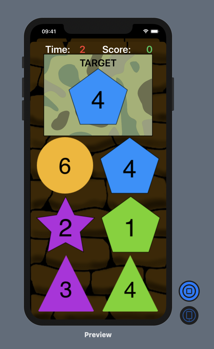
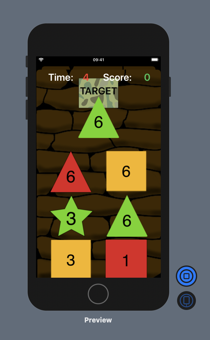
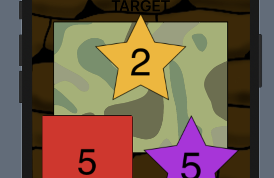
So the first pic is how i want it to look, the second is an example of the problems i get when i change device.
At first glance I would have thought that it would be straight forward to get that layout to resize to the selected device based on the available space.
Mirroring your layout with RoundedRectangles and a series of VStacks, HStacks, overlays and a ZStack, this is the layout that I came up with that looks OK on an iPhone 11 and an iPhone SE.
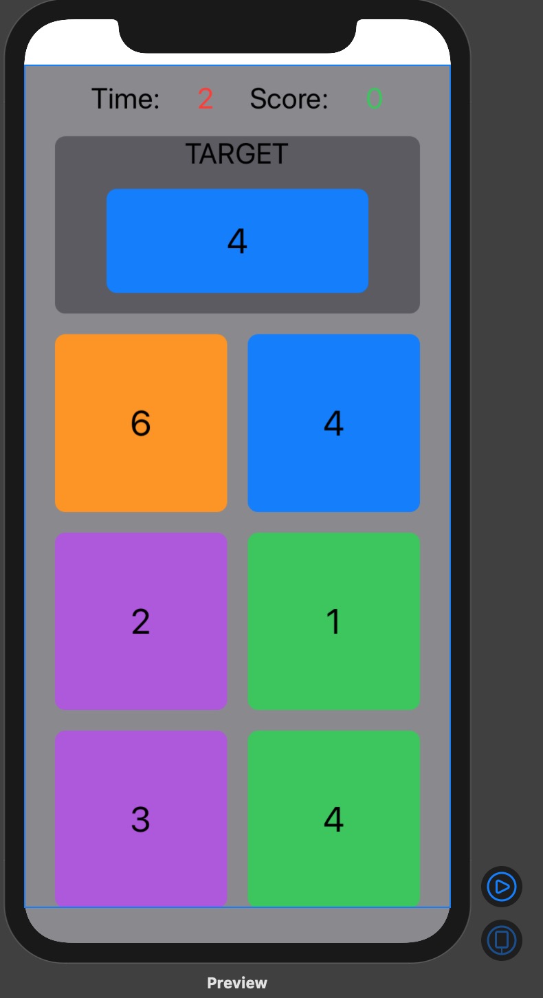
For what it is worth, the code is as follows:
struct ContentView: View {
    var body: some View {
        ZStack {
            Color.secondary
                .edgesIgnoringSafeArea(.bottom)
            VStack(spacing: 20) {
                HStack {
                    Spacer()
                    Text("Time:")
                    Spacer()
                    Text("2")
                        .foregroundColor(.red)
                    Spacer()
                    Text("Score:")
                    Spacer()
                    Text("0")
                        .foregroundColor(.green)
                    Spacer()
                }
                .padding(.top)
                VStack(spacing: 20) {
                    ZStack {
                        RoundedRectangle(cornerRadius: 10)
                            .fill(Color.secondary)
                        VStack {
                            Text("TARGET")
                            RoundedRectangle(cornerRadius: 10)
                                .fill(Color.blue)
                                .overlay(Text("4"))
                                .font(.largeTitle)
                        }
                        .padding(.horizontal, 50)
                        .padding(.bottom, 20)

                    }
                    HStack(spacing: 20) {
                        RoundedRectangle(cornerRadius: 10)
                            .fill(Color.orange)
                            .overlay(Text("6"))
                        RoundedRectangle(cornerRadius: 10)
                            .fill(Color.blue)
                            .overlay(Text("4"))
                    }
                    .font(.largeTitle)
                    HStack(spacing: 20) {
                        RoundedRectangle(cornerRadius: 10)
                            .fill(Color.purple)
                            .overlay(Text("2"))
                        RoundedRectangle(cornerRadius: 10)
                            .fill(Color.green)
                            .overlay(Text("1"))
                    }
                    .font(.largeTitle)
                    HStack(spacing: 20) {
                        RoundedRectangle(cornerRadius: 10)
                            .fill(Color.purple)
                            .overlay(Text("3"))
                        RoundedRectangle(cornerRadius: 10)
                            .fill(Color.green)
                            .overlay(Text("4"))
                    }
                    .font(.largeTitle)
                }
            }
            .padding(.horizontal, 30)
            .font(.title)
        }
    }
}
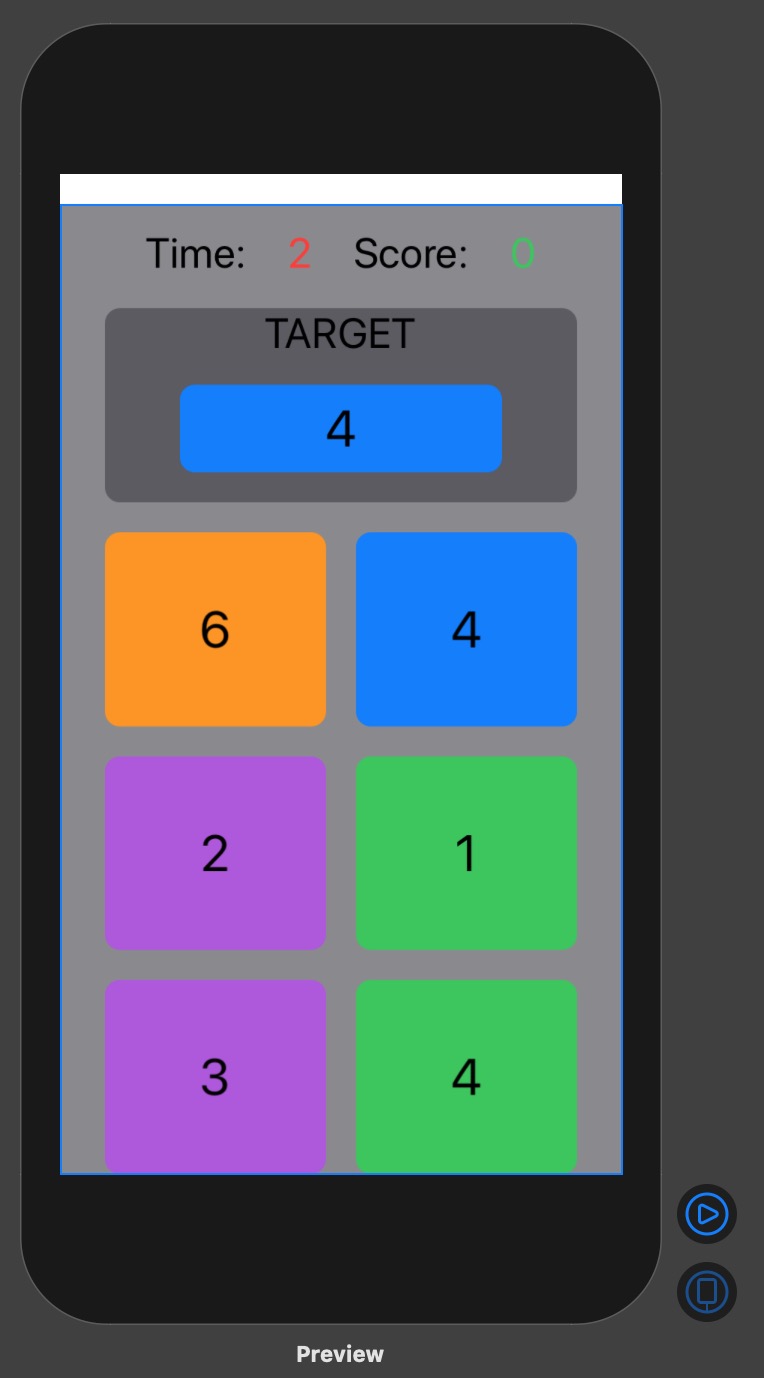
I’m not using the same shapes that you have but even with your shapes and using .resizable()
Wow thanks Chris the .resizable did help me solve an issue with some other images i have but unfortunately not the view between different devices. When i make changes to one such as using .offset(x: 0, y: -10) to lift the images up on the iphone8 screen they are then too high on the larger screens.
So i’ve been playing around with it and when i change the bottom line of this code to size the image it will be the wrong size in another device.
VStack {
                Image("TargetBackground")
                    .renderingMode(.original)
                    .resizable()
                    .aspectRatio(contentMode: .fit)
                    .padding([.leading, .trailing], 40)
                    .padding(.top, 30)
                    .padding(.bottom, 420)
                }
Ideally the .padding(.bottom, 420) size looks best for iphone 8 and .padding(.bottom, 550) looks best for iphone 11.
the camo coloured background is what i’m having the issue with.