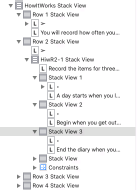
I have a nested stack view hierarchy (see image) that has me completely flummoxed. The second label in ‘Stack View 1’, ‘Stack View 2’ and ‘Stack View 3’ are getting displayed as one line (despite having Lines set to 0 for the labels in the attribute inspector), and are being truncated with ‘…’ at the end of the line. In addition, I’m getting “Need constraints for: Y position or height” for ‘Stack View 1’, ‘Stack View 2’ and ‘Stack View 3’. I thought one of the reasons for using stack views was to not have to set constraints for the contents. My multi-line labels in ‘Row [1-4] Stack View’ are working fine. Have I gone too many levels deep with the nested stack views? What am I missing here? Thanks.
I saw this post earlier this morning my time (about 9 hours ago) but had to nick off to work. (It’s now 17:30 local time here in Perth - Western Australia)
It would be useful to see the result of your constraints on your ViewController in your storyboard so that we have some idea of what you are trying to achieve.
The Document Outline structure does not give the real picture so it would be guess work on our part as to what you need to do. You might need to adjust Content Compression Resistance Priority values or Content Hugging Priority values but I can’t be sure.
In the storyboard, the labels display as expected, it’s the simulator (and devices) where the problem appears. Here are storyboard and simulator images from another part of the screen that I haven’t hacked up trying fixes.
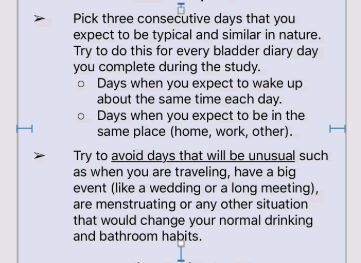
When you say “result of your constraints” are you looking for what I’m expecting? Here’s the view that I get in the storyboard that I’m expecting, but not getting, in the simulator and on devices.
If it matters, there a numerous other labels and stack views on this long (more than one screen size) scroll view containing a list of instructions.
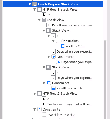
Here’s are the constraints in document outline form for image above (there are no constraint warnings or errors for this VC).
The truncated 'Days when you expe…" constraint is to align the top of the bullet point label with the top of the bullet data label.
The constraints for ‘HowToPrepare Stack View’ are:
.top = 10 from .bottom of the label above it
.trailing = 20 from Content View.trailing
.leading = 20 from Content View.leading
.bottom = 20 to the .top of the label below
Content Hugging Priority, horizontal and vertical, are 250 (default) for all stack views; labels are 251 (default).
Content Compression Resistance Priority, horizontal and vertical, are 750 (default) for all stack views and labels.
I must confess, CHP and CCRP seem a bit like magic to me and despite reading a number of descriptions, I’m not really sure how to properly use them.
Thanks for looking into this. I have been trying everything I can find on the web and nothing seems to work.
Okay, I think I got it. Chris’ comment about Content Compression Resistance Priority sent me back to my go-to explanations for that and Content Hugging Priority. I started adjusting CCRP up for the truncated labels and they expanded! Unfortunately, other labels started getting truncated. Huh? Turns out the freeform height for the VC containing my really large scroll view wasn’t big enough to fit everything. I cranked that size up and things are looking better. There are some constraint ambiguities to work through but I’m on the right track. Thanks for triggering the right spot in my brain.