My First App - Grow (Journey from Scratch!)

This is a completely new idea that I have played with inside my head for the past several weeks and have decided to bring to life upon completion of the Foundations, Networking, and Databases courses offered by CWC+! My plan is to gather and refine feedback on the idea (which I will share here in a bit) so that I can publish an app that serves a purpose and hopefully provides something meaningful to the lives of many Apple users. Here is the rough outline:

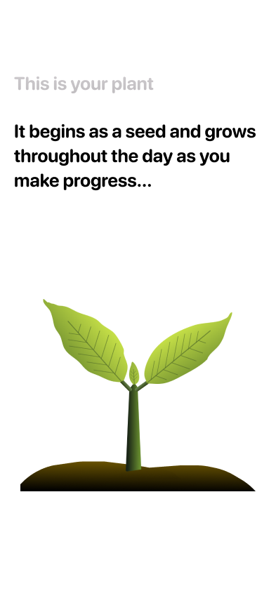
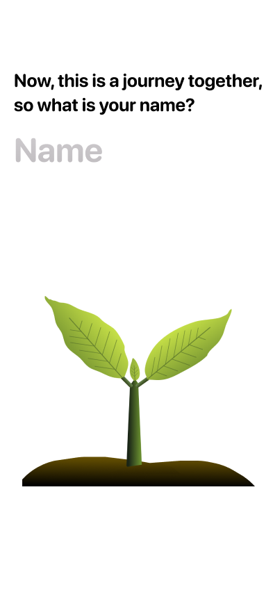
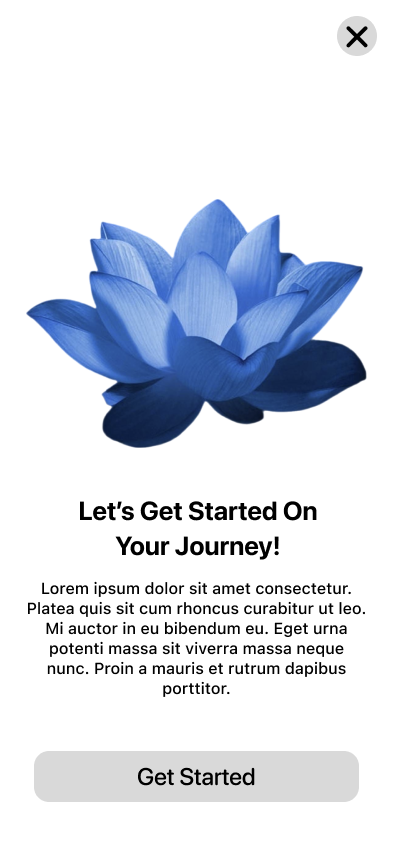
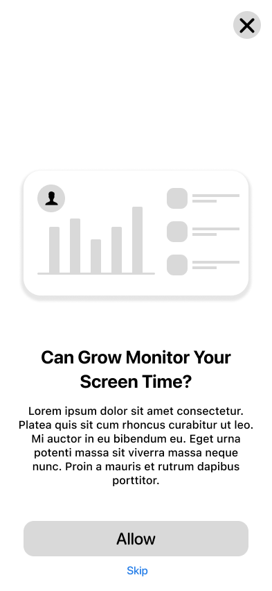
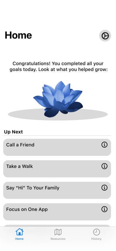
The Grow app will adopt some aspects of a screen time limit and productivity apps while executing its purpose in a much more friendly and meaningful way. Instead of blocking an app or website (giving the impression to the user that they are doing something wrong by spending too much time on distracting material), there will be a notification or full-screen sheet that appears, letting the user know that the Grow app has detected an extended period of use on a certain app or website, and a detailed description along with a suggestion to call a friend or get some sunshine depending on what the user is distracted by. The purpose is to communicate to the user a relevant alternative to scrolling through hundreds of social media posts or watching a bunch of YouTube videos; in short, solutions to time sinks in general. Of course, everyone is different, so customization will be an important aspect of the Grow app, giving the user the say in what content is ā€œdistractingā€ and what they spend too much time on. All of the information will be processed on-device, at least to the greatest extent possible.

Given that this is primarily a concept app, I plan to first launch an MVP of it to see how it is received; plus, I hope to listen to your feedback throughout the design and building process since I have had no experience in publishing an app prior to this. In fact, Iā€™m not even old enough to join the Apple Developer Program! However, that simply means that I will have time to test and refine and polish my app so that when the time comes, I am able to launch something that hopefully at least a couple people will find helpful. Of course, I do not expect the Grow app to be something that will explode with popularity (frankly, I do not even know if it will make it to my own device), but I hope that by following the advice of users and consumers, I am better able to fit the need of a new category or group.

I look forward to any feedback; even a suggestion to change the whole purpose of my app would be accepted! If there are any concerns with my app strategy (which is at best a sketch of what it might be), please let me know. I will try to adjust and improve as needed. Pretty soon I will begin a design concept in Figma (or Sketch) as I learn along with Chris in the App Store course.

Thanks for reading.

-Michael

3 Likes

Update 04/04/2024

Following my first update on the Grow app, I would like to mention what has happened since then.

Having made it through the CWC+ iOS App Store Module 3, I decided to take a step back and really dive deep into app design by taking the CWC+ Design Course and purchasing The Essence of Software by MIT professor Daniel Jackson. I am a stickler when it comes to details and app expression because a clean and beautiful app matters to me and is part of the reason why I primarily use Apple products in my day-to-day life. When I first look at the way Apple design works, it seems extremely simple and intuitive; everything just works, and it works really well. What is complicated is when you think about all the principles that need to come into play before your appā€™s interface becomes second nature and adapts a presence that conforms to the user instead of the user conforming to the device. Appleā€™s Human Interface Guidelines are practically the language of connection between technology and humanity; once you really learn how to implement them, your app becomes a magical piece of software that helps the user accomplish their goals in the most intuitive way possible.

In terms of my app itself, I have created a few design concepts in Figma as well as several pages of my own sketches for how I think the app should look. I am trying to decide which type of flower to use as a progress indicator in my app. Just a reminder, this flower will start as a seed and grow every time the user accomplishes another step towards their goal. Once they reach their goal, the flower will bloom in celebration of a good days work. So far, I have been using a rose in several different colors, but there a few problems: 1. A rose grows from a rose bush, not on a single stem. 2. Roses generally symbolize friendship and relationship related events. 3. Roses are rather complex plants and might draw away from a simplistic and understandable interface. Bearing this in mind, perhaps you can at least get an idea of what my app will look like from the screenshots I have provided.

Thanks for reading, and I look forward to sharing my progress next week, if all goes well!

-Michael

P.S. The rose was designed by hand using Figmaā€™s Pen and Pencil tools. I traced over a picture of a rose and used the color picker tool to match the plantā€™s real colors in my depiction of it. I used a similar process to create the first concept of the small plant.

1 Like

Awesome. Very creative! Love the plant idea.

One thought I had while reading your descriptionā€¦ how can you track the usage of other apps from within your app? Does Apple provide an API for that?

I like the idea and look forward to seeing where you take it.

Thanks!

Great question. I havenā€™t thought too much about the coding part, but in my initial designs and ideas about how to execute the appā€™s functions, I decided that Appleā€™s Screen Time API may at least give the Grow app insight into the userā€™s general device usage. Overall, I think the plant/flower growth will be more of a user-triggered action (for example, if the user is texting back and forth with their friend, they might receive a notification suggesting they call their friend instead and when they tap on ā€œCall this friend,ā€ it will update the plant growth in the Grow app and call this friend). I feel like the only way to know for sure if the user completes the goal is to have them click on an action that directly leads them towards the alternative action (such as ā€œCall this friendā€). Let me know if you have any suggestions! I feel like there could be some better and more efficient way to complete this. My hope is to avoid the on-device strain of calculating all the achievements and goals of the user, and instead have the app work much like the CWC+ Project Tracker app in terms of user-input effects.

That was probably more information than you needed, but hopefully that gives you more of an idea on how I plan to execute this.

Have a nice day!

-Michael

Update 04/11/2024

Well, I am quite excited to present my latest update on the Grow app!

Since last week, I have been able to complete the User Journey map and make some important decisions for the appā€™s architecture. Pretty much all of the Wireframes are complete, giving me a good idea of how flow, interaction, and layout will work. I read through a few chapters of The Essence of Software by Daniel Jackson, helping me to discover the fundamental principles that support good design, concepts being one of the most important aspects. (Concepts basically means what works behind the scenes of an app; for example, Wordā€™s primary concept is the paragraph since editing and creation in word are based on paragraph style.) My inspiration in the design process has been from ChatGPT, Dribble, and Mobbin, providing me with a strong foundation for my appā€™s interface.

In terms of design, I have decided that the Lotus Flower will represent the userā€™s progress best in my app due its beauty when in bloom, as well as what it symbolizes in many societies: namely resilience, beauty, etc. Anyways, that is where Iā€™ll leave it for this week! The pictures will tell more about it than my words can. By the way, I was only able to include some of the photos since there were a lot of them!

2 Likes

Great progressā€“very cool :slight_smile:
Good idea creating that user journey map as well. Helps one understand the view flow.

Thanks! Just for reference: Red Arrow = ability to leave current screen and go to assigned view; Green Arrow = result of navigation (i.e. result of clicking on TabBar item or clicking ā€œContinueā€); Yellow Arrow = result of scroll behavior within same page; Blue Arrow = result of action from within another view (such as adding a system-generated suggestion to the Up Next list under the Home tab).

Also, here is a link to the Figma preview for the Grow app Wireframes in case you want to get a better idea of the flow (this only works well on an iPhone 15 or 14 preview): https://www.figma.com/proto/FkzmUn1ft8p7wHvYCMAU7H/App-Interface-Design?page-id=99%3A10&type=design&node-id=190-600&viewport=-457%2C438%2C0.29&t=ArOltXo8Q0xrSuQX-1&scaling=scale-down&starting-point-node-id=190%3A538&show-proto-sidebar=1&mode=design

NB: No Update 04/18/2024 or 04/25/2024

Hello, CWC community! I will be out of town this coming week and will not be able to post another update until I get back. Unfortunately a very busy schedule leading up to this trip has made it difficult for me to make any progress on my app, so I have decided to withhold any updates until later. I apologize for the inconsistency. See you when I get back!

Have a nice day.

-Michael :slight_smile:

Hi Michael,

I just came across your posts and I like your idea of creating your own app very much.

Love the design! Itā€™s simple yet the plants and flowers (which I like a lot) bring color and life in the mix.

I am also in the process of creating one of my first apps of which theme lies close the one of your app. So I thought itā€™s cool to see someone whoā€™s on the same path. Maybe we could help each other in the future with designing and coding our apps.

Good luck with creating Grow!

Kind regards, Rune :slight_smile:

Hello Rune,

Thank you!

I would really enjoy helping each other out on our app ideas! I think that is a great way to try and push through the struggles of designing and coding (and, perhaps, launching) our apps.

Are you planning to launch your app onto the App Store at some point? Thatā€™s at least my goal, though I am not yet old enough to join the Apple Developer Program.

Recently I have encountered a somewhat major road bump: As suggested by Professor Daniel Jackson in his book The Essence of Software, he specifically states that it is important to define the concepts (ie: the elements that make your app functional and useful, such as the notification concept or the screen time concept) of your app before designing it. Unfortunately, I have taken a somewhat backwards approach to this, designing the wireframes before deciding how the app is going to workā€¦ Now I am trying to figure out what is the best way to help the user use their device productively and what concepts would help me out in this respect. Really, the purpose of my app is to present to the user a more efficient strategy than the one they are currently employing (such as thinking on paper instead of staring at a blank page on a screen), but I do not know how best to do this yet.

Well, thatā€™s my issue. So, perhaps you can let me know if there are any issues you are facing in your app creation process and we can figure out how to fix them.

I hope your app works out well! Do you have any user journey charts or sketches of your app?

-Michael :slight_smile:

I actually started developing my app and the idea behind it when I first heard of Appleā€™s Swift Student Challenge, so my goal is to participate in them with my app and also go through the whole process of creating an app from scratch to end for the first time and learning along the way. Iā€™ve already done brainstorming about my app and finished the design. The app is called GoalPilot and aims to help people achieve their dream goal in life by guiding them through such journey, this will be done by providing wise life lessons but also always make it suggestive instead of mandatory, thatā€™s why the app is a ā€˜guideā€™ and not a ā€˜step-by-step planā€™. It will also help them to define their goal and create their plan to achieve it, and then send reminders to keep the user motivated and providing a visual representation of their journey to their goal.
As my design is done, Iā€™ve started coding and working on the onboarding. If youā€™re stuck with brainstorming, this file by Apple helped answer the right questions, along with enough creativity, which I can see you have lots of, you should be able to get a better understanding of features and the purpose of your app and how it will achieve its purpose.

This is that file:
Download the file

I havenā€™t gone through the whole file, but the beginning of it certainly helped me a lot.

As for my design, Iā€™ve designed many screens, but Iā€™m happy to share some to give you an idea of my design.
Onboarding Welcom Screen:

Journey Screen:

Planner Screen:

MyGoal Screen:

The only thing that Iā€™m concerned about is that I might be a bit too enthusiastic and that my programming skills arenā€™t yet good enough to pull this app off, but Iā€™m staying positive. :slight_smile:

In the coding part, Iā€™m now stuck with SwiftUIā€™s keyboard avoidance and some lag in my app from which I donā€™t know where it comes from. As for the keyboard avoidance, Iā€™m going with the approach of putting my view in a ScrollView and letting SwiftUI figure out the contentOffset of the content in my ScrollView to reveal the focused field. But SwiftUI doesnā€™t recognize any added padding or frames to the textfield as the field itself, which results in my textfieldā€™s design not being shown fully when the textfield needs te be scrolled up. The user can manually scroll some more up to fix this, but I donā€™t want to rely on that.

So thatā€™s the issue Iā€™m now facingā€¦
I hope the file of Apple might help your brainstorming.

Greetings, Rune

1 Like

PS: Please do share some ideas or criticism about my design, any opinion is valuable!

This is incredible! I did not expect that you would be this far along in your app creation process. Thanks for sharing your goals for GoalPilot (no pun intended). I have also considered entering the Swift Student Challenge, especially since it is a great opportunity for me to challenge myself, and, if it so happens, receive a reward for my work that I can present to colleges or to companies I may want to work for. I can see the connections between your app idea and my app idea such as suggestions instead of restrictions (or commands), the idea of accomplishments such as the growing flower or your progress charts, and the challenges of making an app from scratch as a newbie developer.

Thank you for sharing this helpful file. I came across it, but did not realize its importance until now. I look forward to reading through it.

Very clean and consistent design. I appreciate the color scheme that is carried throughout your app. The design of your home (or Journey) screen is super cool. Did you make this background design yourself, or base your color scheme off of this image? (By the way, I think you missed a space between ā€œGoodā€ and ā€œmorning.ā€) Overall, great work.

Honestly, I feel the same way. I want to design my app first along with all the concepts I plan to use (as I see you have done), and then dive into the programming part. That way I know exactly what I am trying to accomplish when I code the app, and I can search for specific information on the web instead of just searching ā€œhow do I create a notification?ā€ after starting my Xcode project.

I would suggest that you pose this question to ChatGPT since I really am not at this level yet. After some research, I did find some articles that may be of use to you: 1) SwiftUI keyboard avoidance | FIVE STARS 2) Keyboard Avoidance for SwiftUI Views. This is definitely an important problem to fix for the sake of continuity between Appleā€™s rigorous design guidelines and your app. Let me know if you find any excellent solutions since I assume that I will be faced with this problem at some point! One thing that worked really well when designing the ProjectTracker app with CWC+ was to edit the text within a Sheet view so that when you click on the TextField() only the Sheet is moved up across the screen and the rest of the content is kept static in the background. Perhaps this doesnā€™t work well with your app, though.

Take care,
-Michael :slight_smile:

1 Like

Update 05/02/2024

Finally, after a couple of weeks, I have another official update on the Grow app.

Well, I have taken several steps back and decided to revisit the purpose of my app, and what concepts I will use to complete this purpose. Primarily, I have come up with a rather rough statement about the purpose of my app, which is ā€œto encourage cell phone users and device users to reduce the time spent on distractions and devices in general, helping them stay motivated to focus on one task at a time.ā€ So, from this, I can gather three key goals: 1) reduce distractions, 2) focus, 3) motivation. Basically, I want to help the user avoid going on rabbit trails such as clicking on a notification which takes them into Facebook, then clicking on a nice picture and searching for the location, then looking into details of how to travel there, then looking into what equipment theyā€™ll need to shoot a cool photo there, etc, etc, etcā€¦ I feel like we could save so much time if we just learn how to focus on one task at a time in life; the problem is that technology is partly built for this purpose so that it can draw the user in and get them to use their device as much as possible.

Anyways, I am looking into solutions for these problems such as designating a specific timed focus which blocks other apps, leading to plant growth within the app as the user progresses through the focus and completes the tasks.

Hopefully I will have a more organized update for next week, but thatā€™s it for now.

Have a great day!

-Michael :slight_smile:

1 Like

Thanks for thinking with me! I am very glad you liked my design, as I was a bit unsure if it may be too busy. Actually, the color palet did not really come from my Journey Screen, I just had an idea of what my app should look like and begin designing, first the MyGoal Screen and after time I got a better idea of what my design was so I was able to design the Journey Screen. So I think you are right about designing first and coding afterwords, as you indeed have a much better understanding of how everything should look and what the features of your app should do. I think this is much more efficient way to write code.

Also thank you for pointing out my spelling mistake, as you might see, English is not my native language so I have already corrected it! I already came across both articles on the web, they both were of great help for me. The only issue I had with the design of the second article is that it seems to be a lot of work to actually achieve what SwiftUI has somewhat built in, I donā€™t what to nitpick but in my experience you should always ask yourself if the code implement doesnā€™t come with to much complexity, which can be a hassle while debugging and just isnā€™t as clean to further built upon, as opposed to what it does. And I especially want to keep my code clean as Iā€™ll send it to Apple for the Swift Student Challenge. So I am instead looking more on the side of letting SwiftUI do the hard work, which more alines with the first article you send, however this doesnā€™t take the frame of textfield into account when pushing it up to show above the text field. Maybe your suggestion of putting the text field in a sheet might work, but could you please clarify this as I donā€™t think I fully understand what you mean.

As for the file I shared with you, it is indeed a bit general. But you could see it as a guide made by experienced app designers (being Apple) to let you go through the right steps of creating an app, defining features and screen outlines before heading into designing and afterwords coding.

Itā€™s great helping each other out! If youā€™re stuck with coding or designing, feel free to reach out!

  • Rune :slight_smile:

Great progress! It seems like you already have a much better understanding of what your app does and what it features will be! I donā€™t fully know myself how you could address these features in code, but I think there might some API letting you know when the users jumps to another app and which app this is. Although I am not sure of this as it seems that your app must be running while there is no session for it, meaning your appā€™s ScenePhase will be inactive.

Of course! Overall, your design was great. I do think that maybe the design could be simplified a bit more, and perhaps you could try making the user journey list on the ā€œJourneyā€ screen more compact so that the user can see most of the journey. I would make the launch screen background color a little bit lighter gray so that the button and text stand out more; and overall, I would just be careful about too many shades of gray, especially on your launch screen. These are just some ideas that have come to mind since I last wrote, after I have had some time to think about it a bit more. :slight_smile: I really like the progress concept, though! Especially how the indicator maintains continuity in appearance both within the ā€œMy Goalā€ screen cards under the ā€œCriteriaā€ section, and the list within the ā€œJourneyā€ section. Also, great calendar design; very clean and intuitive.

Great! I am glad you came across these articles already. I totally agree with you that it is best not to implement code that is too complex for you to deal with it efficiently; especially when debugging. See my attachment (sorry about the low video quality) for an example of what I meant about embedding the TextField into a Sheet.

Right. And these talented designers from Apple have many more years of work under their belt than myself (who am literally trying to learn just the most basic design principles). By the way, I highly recommend the book I was talking about (The Essence of Software by MIT Professor Daniel Jackson) since it is super helpful with uncovering how to design an app by taking into account Appleā€™s and Microsoftā€™s design and concept implementations (as well as many other companies) and the issues and benefits that the companies found in the process. Through these examples, the professor helpfully analyzes how we can learn from this. Anyways, just a thought; thereā€™s no need to buy it. (Itā€™s about $30 on Amazon, or you can find it through Princeton University Press.)

Do you have any design suggestions for me? As you may already know, I have only created wireframes so far (the app screens that I posted earlier), so there is really a lot of flexibility. Layout, titles, descriptions, buttons, etc are all open to conversation. Iā€™m trying to think of a magical way to design the Lotus flower so that it animates as it grows and reacts to taps; it grows in water, so I was thinking that .onTapGesture could capture that and send ripples that splash against the sides of the screen. Just some ideasā€¦

In reply to your comment on my update, these are some valid concerns. I plan to look into the different APIs available and decide what features are possible and which pose challenges.

Thank you for your thorough replies! I will try and do the same while attempting to remain concise.

Iā€™m looking forward to WWDC24! Especially with AI on the horizon (something that could be very useful for us developers).

Sheet TextField

Youā€™re right about the Journey screen, it was my original idea to not include a list and show all information in the drawing, but I had a hard displaying all info I wanted to show the user all in the drawing to make it useful to have but while keeping the design simple and clean, so thatā€™s why I designed it with the list below it. But maybe this indeed isnā€™t the best approach. Also, thanks for all other advice you gave, Iā€™ll take a look at my design again and take it into account, itā€™s really helpful to have a personal meaning from someone else when designing an app!

The implementation of a TextField in a sheet could fix the issue, but Iā€™m afraid that it wouldnā€™t totally fit with the design Iā€™m going for. Thanks for the suggestion though!

Thanks for the recommendation on the book of Professor Daniel Jackson, Iā€™ll take note of it to read it when Iā€™ve finished my other books. It looks indeed promising and very interesting!

Well, concerning layout, fonts and so on, thereā€™s lots you can do. However the best tip I can give you is that simplicity is the key, if you can make your design look clean, simple and logic and make animations logic and smooth, you will certainly have a positive effect on the user. It can be tempting to try and stand out with your app using a different design, but in my opinion it is ok if youā€™re design looks a lot like other apps, especially for navigation, there should be continuity with what the user is used to. So Iā€™d not spend a lot of time on deciding thinks like layout or which fonts youā€™re going to use, just follow the guidelines provided by Apple. Instead Iā€™d focus more on the key elements of your app that make your app unique. In your case this could be your flower design and animations (also keep in mind here: simplicity is the key), and the features of your app to make the user reconsider if they want to continue on social media or do some of the proposed activities. Well, thatā€™s my opinion, I just want to say Iā€™m certainly not an expert so I may be wrong :sweat_smile:.

Thank you for your thorough replies as well! By the way, I hope my English isnā€™t to bad for you to understand, as I see yours is very good.

I too look forward to WWDC24, itā€™ll be interesting and maybe bring some new features to Swift to play with!

Yes! I can understand. Honestly, the design is pretty clean. Based on the situation, I would probably just reduce the space in between the ā€œHave a macā€ title and the card (for example) on the ā€œJourney" screen, and also reduce the space above the title (just by a few points). I donā€™t remember what the standard spacing would beā€¦ Great idea for the journey depicted on the ā€œJourneyā€ screen background! I just noticed. By the way, Iā€™m no design expert, itā€™s just that Iā€™m detail-oriented. :wink:

Okay, no worries. Iā€™ll let you know if I find anything else that would be a valid alternative.

Sure! I plan to implement the professorā€™s tips in my design process, so you may get a lot of info for free through reading my weekly app updates.

Thank you! I appreciate your saying this since I really need to just think about the concepts themselves and stick with a simpler and more traditional design. Sometimes it can be easy to think that oneā€™s first app needs to ā€œchange the worldā€ and be a ā€œgroundbreakerā€ in technology, but often it requires some humility and just stepping back a bit before taking on the world. After all, ā€œpride comes before a fall,ā€ so itā€™s better to reverse that (ā€œhumility comes before a riseā€).

Your English is quite impressive, actually! I could not tell until you told me that you are not a native English speaker. Your sentences and paragraphs are quite succinct and clear.

True.

Have a good afternoon!

-Michael