greetings,
I have watched countless presentations on views and stackviews. I’ve built a nice little app for in-house use at work. I simply CANNOT crack layouts to view on different phones / tablets dimensions.
I watched two from codeWithChris, and although I followed step by step, my Xcode simply refuses to behave as his does. I’ve bee struggling with this topic for about 30 full hours now.
His narration was really good too. He was slow and methodical, but Xcode over here just will not cooperate.
I’m on Xcode 11.6.
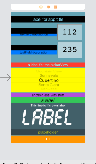
I’ve got 14 elements on the screen (textFields, a pickerView, and a lot of labels).
7 of these elements are as simple as you’d want: vertically aligned and they stretch from side to side. The other 7 are in need of views and stack views to align them properly.
I simply cannot get Xcode to perform as no less than 10 people have explained. And, I can’t get anyone to offer more than just a few vague lines with no followup when their instructions/advice were not clear.
Stop making tutorials that are kindergarten level in complexity. I need to see some more difficult alignments that require nesting.
I’m hoping this community can help, because I’m right about there for motivation now. I’m ready to walk away from this at this point. I can’t invest any more time if aligning damn boxes on a screen is really this complicated.
Hi Robert,
Welcome to the Code Crew community.
You would not be the first person to struggle with getting constraints to work so that the UI looks OK on all size classes that the App may be used on.
That’s the challenge.
At a first glance your UI looks a little cluttered. Is the issue more problematic in height or width with respect to device size differences?
If you must have so many elements on a single View, and the problem is more to do with the height of the device it is running on, have you considered embedding them in a ScrollView to effectively give you more vertical “realestate”?
HI, thanks for replying.
It’s designed for an iPhone 8, and it fits quite well. Yes, I really do need all the elements.
The problem isn’t the fit. There’s more than enough room to show it up on an 11, or iPad (which is the next most likely place to see it).
The trouble is:
-
I just don’t know where to start. I’ve tried using views; tried just stack views ; tried using both.
-
each element is colored differently up there for reference (save that off green BG color). I’m not clear why you say it’s cluttered: it’s a page control, 5 labels, a picker, a label, then “2” groups of labels and a text box—with a title at the top. Are you suggesting something like making an image in place of labels? Only the top black and blues are static. Those other labels have dynamic values due to code.
-
For example, if I try using a stack view on the picker it explodes in size and won’t let me adjust ANY settings.
-
I need a solid workflow explanation–based on the needs above–and not a few simple blocks that work perfectly for a 10 minutes YouTube video. That’s the trouble: reaching someone that can give steps to understand the workflow. I’ve been at this for two weeks now. The app is finished; the code could use some efficiency work on it, but I’ve been held hostage by these damn constraints. The iPhone 8 is the smallest that it will see. I just want it to retain proportions and fill as it goes up in device size.
-
sometimes when trying to work top down I can’t even see the next view or stack as a constraint option. Or the first and second elements get swapped; or the stack exploded outside the boundaries of the storyboard.
I apologize for the scattered nature of this post.
The lessons that Chris has set up are intended for beginners specifically to get them up to a level where they can begin to experiment with more complex layouts that they need for whatever App idea they have.
Mastering AutoLayout Constraints is hard, there is no denying that. Getting the elements to fit and operate as intended takes considerable finesse as you are discovering. I’m no expert in that regard and even after 2 years playing around with UIKit I still encounter situations that baffle me as to why they don’t work as expected. So you are not alone.
If you are designing your screen for the smallest size then wanting to adjust the layout to cater for larger devices, you will need to add ‘Variant’ constraints that address specific size classes and add space where it is reasonable to add space to spread the UI out.
If you are unfamiliar with constraint variants and size classes then you need to look up that subject. Chris covers an example of how you implement size class variants in the War Card App. Take a look at this video.
Testing the UI on different devices starts at 16:15. Talking about Size Classes starts at 19:28 and implementing constraints for the various Size Classes starts at 20:54.
The constraints in this instance deal with overlapping UI elements but the point is that in your instance, where you want to spread the UI out for larger devices, you can just as easily select elements that you want to be larger and add a variant constraint to suit.
Thank you Chris, for you time taken to reply.
I test on an iPhone 8 because that’s what I have. I use the simulator to scale up to an 11 and iPads–the next likely users of this.
I’ll get started on that video right now.
I was under the impression that if I tuck my elements in a view, a tuck the view in a stack, and then set the elements:view constraints (and the view to stack constraints), and finally the stack to superview constraints----that was all I needed. IF the device were bigger the main stack would adjust, dragging everything with it.
I notice in his videos he has an iPhone 8 under devices. I do not. I have the 8+. The only option I can find close is the SE 2nd Gen, but it doesn’t show the clock area at the top, and if I click safe area, it highlights the entire screen. I’m not certain if this is significant to my problems. If I change it to an 11 I see the safe area drop down to avoid the clock and battery.
I started to make some progress, but after making a vertical stack on the left side I created a vertical stack for the two text fields (with the numbers in them). As I adjusted their constraints away from the stacks to their left…THOSE stacks abandoned their constraints and got pulled to the other side of the screen. This is the junk I’m talking about. Any adjustments are systemic throughout the board and not neatly confined as every tutorial on earth would suggest.
You can create a custom simulator by adding a device of the size you want. You do that via the dropdown menu where you choose the simulator you want to use.
I have the 8 there, no troubles. But, the device view down by the assistant. I can’t get an 8 there. And, every example online that shows an iPhone 8 down there has a safe area that is slightly lower than the superview because there is a clock and carrier information up there.
I was told to just use the SE 2nd Gen for similar dimensions, but its Safe Area is the entire screen, and I’ve had things sneak up into the clock / battery/carrier data.
Does that make more sense than the OP?
The device options in Interface Builder (Storyboard) cover all of the size classes you need. If you confine everything so that you don’t violate the top and bottom safe area, you don’t need to be concerned that the one you are using has a notch or doesn’t.
You’re missing my point.
Read carefully:
1 every video shows someone click the safe area (in fact, I’m watching one here that’s an 8) and the safe area indents.
-
I was told the SE 2nd gen is what to use when working on an 8 layout.
-
if I click SAFE AREA the entire superview highlights.
-
if I build items in the highlighted area, they protrude into the coveted safe area at the top of my REAL iPhone 8.
-
translations: the highlighted Xcode safe area ! = the actual safe area on iPhone 8 (if the device used is SE 2nd Gen).
Why does a current tutorial show an iPhone 8 as a selectable device (NOT A SIMULATOR) when my Xcode is severely limited?
For the record, I am trying to help.
Getting irritated is not going to help your cause either.
I have one other suggestion, I can take a look at your project IF you’d like. To facilitate that, compress your project at the root level and post it to Dropbox and share a link here in a reply.
I realize you’re trying to help. You are, at a minimum, the 10th person that has opined on the subject. The verbiage is always the same, and the results are always off.
Stackoverflow, YouTube, appbrewery (useless facilitators over there btw), a myriad of forums. You are not catching me at my best. I put together 300 lines with 0 previous experience in a mere fraction of what was supposed to be the “desktop publishing layout” part that everyone fawns over as being straightforward.
I’d be happy to have you look at it. I’d rather send the link via email.
PM’d you. Check your username inbox.
Hi Robert,
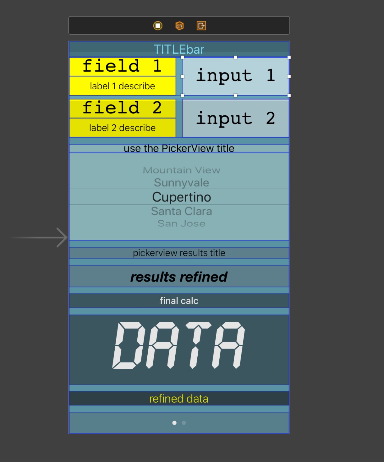
Far out, this is proving to be awkward. I’ve got one element (input 1) that is supposed to be inside the stack view as per the storyboard layout like this:
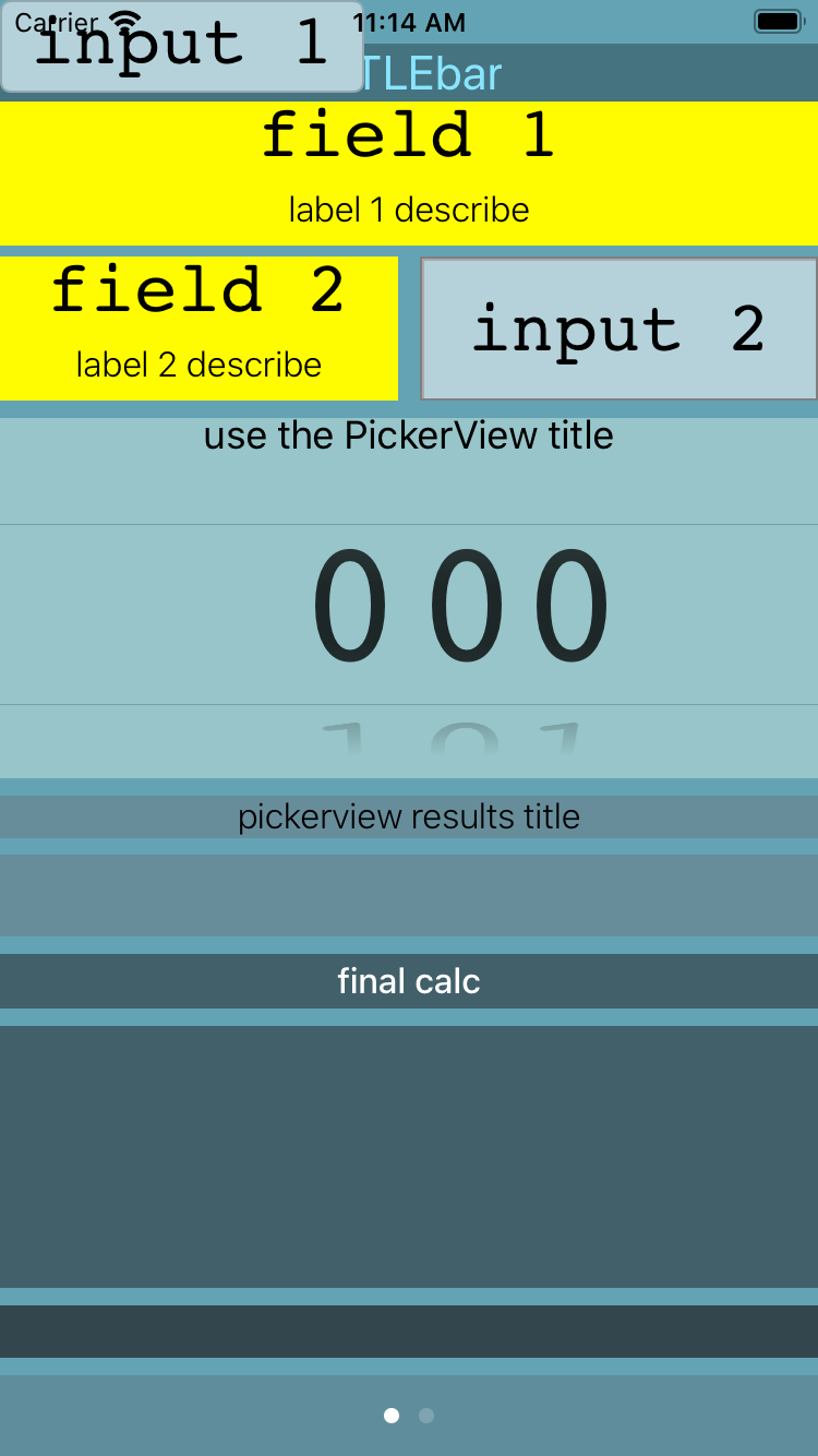
…but when I run the project, THAT label decides that it hates its parents so leaves home and heads up into the top left hand corner of the screen. No idea why and it makes no sense at all.
It is possible that there is some internal problem that may only be able to be overcome by starting a new project. I’ve cleaned it, deleted the build folder and re-complied it… nada.
I tried replying, but I’m no sure it went through.
I’m going to pull Xcode and re-install with the current beta that’s posted now (12.x).
I suppose I can just copy/paste the code and then re-build the text fields and such. I didn’t really have any images (just an app icon).
I would recommend against downloading beta software if you are a beginner.
Betas have bugs in them.
What version of Xcode will work with iOS 13.6.1, because when I updated my phone to 13.6.1 it stopped working with Xcode. So I updated.
I’d be happy to move down off a beta.
As Mikaela has advised, don’t install Xcode 12 because there will be other issues besides it being unstable at the moment.
I would be surprised if there is anything wrong with your version of Xcode. I presume you were/are using Xcode 11.6. By all means delete it and reinstall the current version from the App Store if you think that will help.
Try starting a new project and recreate the items in storyboard. Copy the ViewController code over from the old project and reconnect the outlets once you’ve finished reconstructing your storyboard.
Ah jeepers, found the problem. I should have looked closely at your code. All works nice now.
OR
You need to update Xcode from the App Store. But may need to wait. I don’t think the latest version of Xcode works with iOS 13.6.1, which is why as a developer, you need to be cautious of what iOS versions you update to because Xcode isn’t always compatible. (It later will be compatible, it just depends when Apple releases the next Xcode update)
 - Lesson 4")